R for Data Science Ch 3.7

3.7 Statistical transformations


The algorithm used to calculate new values for a graph is called a stat, short for statistical transformation.


Let’s take a look at a bar chart. Consider a basic bar chart, as drawn with geom_bar()

ggplot(data = diamonds) + 
  geom_bar(mapping = aes(x = cut))

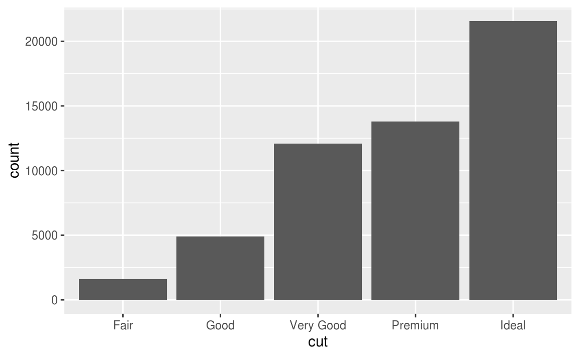
留意上圖中的 y 軸,為cut之下每種不同level的累計數(bin),y 軸對應的並非是自變數!
因此bar charts, histograms, and frequency polygons這類的繪圖,會經過下列的過程(algorithm),y軸對應的是特定的統計量。
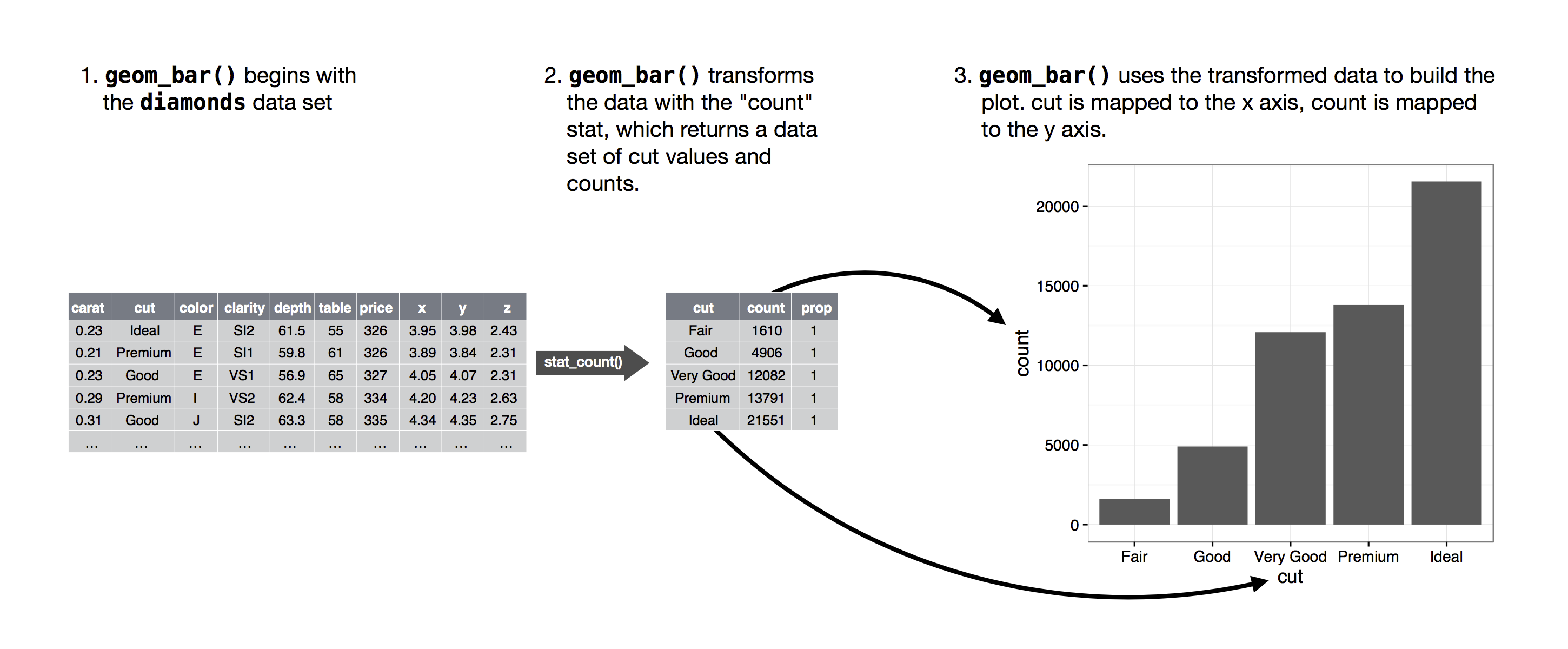
how this process works with geom_bar()
ggplot(data = diamonds) + 
  stat_count(mapping = aes(x = cut))

#ggplot(data = diamonds) + 
#  geom_bar(mapping = aes(x = cut))

以上程式區塊內的兩種寫法output的結果相同,因為每個geom 函數有內建的stat 函數,每個stat 函數也有預設的geom 函數,只有下列的情況需要特別指定繪圖的statistical transformation:

  • want to override the default stat
demo <- tribble(
  ~cut,         ~freq,
  "Fair",       1610,
  "Good",       4906,
  "Very Good",  12082,
  "Premium",    13791,
  "Ideal",      21551
)

ggplot(data = demo) +
  geom_bar(mapping = aes(x = cut, y = freq), stat = "identity")
#This lets me map the height of the bars to the raw values 
#of a y variable.
  • want to override the default mapping from transformed variables to aesthetics
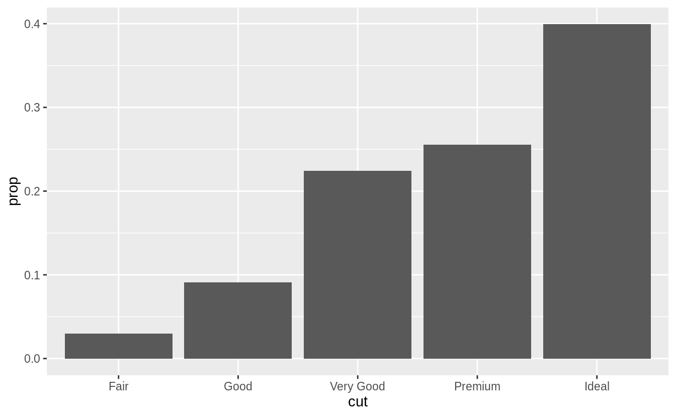
# display a bar chart of proportion, rather than count
ggplot(data = diamonds) + 
  geom_bar(mapping = aes(x = cut, y = ..prop.., group = 1))

To find the variables computed by the stat, look for the help section titled “computed variables”.

  • draw greater attention to the statistical transformation in your code
#stat_summary(), which summarises the y values for each unique x value

ggplot(data = diamonds) + 
  stat_summary(
    mapping = aes(x = cut, y = depth),
    fun.ymin = min,
    fun.ymax = max,
    fun.y = median
  )
stat_summary()

Exercise 3.7

Exercise 3.7.3

  • The following tables lists the pairs of geoms and stats that are almost always used in concert.
geomstat
geom_bar()stat_count()
geom_bin2d()stat_bin_2d()
geom_boxplot()stat_boxplot()
geom_contour()stat_contour()
geom_count()stat_sum()
geom_density()stat_density()
geom_density_2d()stat_density_2d()
geom_hex()stat_hex()
geom_freqpoly()stat_bin()
geom_histogram()stat_bin()
geom_qq_line()stat_qq_line()
geom_qq()stat_qq()
geom_quantile()stat_quantile()
geom_smooth()stat_smooth()
geom_violin()stat_violin()
geom_sf()stat_sf()
  • The following tables contain the geoms and stats in ggplot2.
geomdefault statshared docs
geom_abline()
geom_hline()
geom_vline()
geom_bar()stat_count()x
geom_col()
geom_bin2d()stat_bin_2d()x
geom_blank()
geom_boxplot()stat_boxplot()x
geom_countour()stat_countour()x
geom_count()stat_sum()x
geom_density()stat_density()x
geom_density_2d()stat_density_2d()x
geom_dotplot()
geom_errorbarh()
geom_hex()stat_hex()x
geom_freqpoly()stat_bin()x
geom_histogram()stat_bin()x
geom_crossbar()
geom_errorbar()
geom_linerange()
geom_pointrange()
geom_map()
geom_point()
geom_map()
geom_path()
geom_line()
geom_step()
geom_point()
geom_polygon()
geom_qq_line()stat_qq_line()x
geom_qq()stat_qq()x
geom_quantile()stat_quantile()x
geom_ribbon()
geom_area()
geom_rug()
geom_smooth()stat_smooth()x
geom_spoke()
geom_label()
geom_text()
geom_raster()
geom_rect()
geom_tile()
geom_violin()stat_ydensity()x
geom_sf()stat_sf()x
statdefault geomshared docs
stat_ecdf()geom_step()
stat_ellipse()geom_path()
stat_function()geom_path()
stat_identity()geom_point()
stat_summary_2d()geom_tile()
stat_summary_hex()geom_hex()
stat_summary_bin()geom_pointrange()
stat_summary()geom_pointrange()
stat_unique()geom_point()
stat_count()geom_bar()x
stat_bin_2d()geom_tile()x
stat_boxplot()geom_boxplot()x
stat_countour()geom_contour()x
stat_sum()geom_point()x
stat_density()geom_area()x
stat_density_2d()geom_density_2d()x
stat_bin_hex()geom_hex()x
stat_bin()geom_bar()x
stat_qq_line()geom_path()x
stat_qq()geom_point()x
stat_quantile()geom_quantile()x
stat_smooth()geom_smooth()x
stat_ydensity()geom_violin()x
stat_sf()geom_rect()x

Exercise 3.7.5
In our proportion bar chart, we need to set group = 1 Why? In other words, what is the problem with this graph?

# group = 1 is not included
ggplot(data = diamonds) +
  geom_bar(mapping = aes(x = cut, y = ..prop..))
#The proportions are calculated within the groups, 
#all the bars in the plot will have the same height, a height of 1
ggplot(data = diamonds) +
  geom_bar(mapping = aes(x = cut, y = ..prop.., group = 1))
  • With the fill aesthetic
# Wrong Answer
ggplot(data = diamonds) +
  geom_bar(mapping = aes(x = cut, fill = color, y = ..prop..))
# With the fill aesthetic, the heights of the bars need to be normalized.
ggplot(data = diamonds) +
  geom_bar(aes(x = cut, y = ..count.. / sum(..count..), fill = color))

R for Data Science Ch 3.6

3.6 Geometric objects
geom is the geometrical object that a plot uses to represent data. 

For example, bar charts use bar geoms, line charts use line geoms, boxplots use boxplot geoms, and so on. Scatterplots break the trend; they use the point geom.

To change the geom in your plot, change the geom function that you add to ggplot().

以下例子使用相同的data set但不同的geom函數作圖:

ggplot(data = mpg) + 
  geom_point(mapping = aes(x = displ, y = hwy))
geom_point( )
ggplot(data = mpg) + 
  geom_smooth(mapping = aes(x = displ, y = hwy))
geom_smooth( )
  • set the group aesthetic to a categorical variable to draw multiple objects
#尚未群組化之原始code
#ggplot(data = mpg) +
#  geom_smooth(mapping = aes(x = displ, y = hwy))

#set the group aesthetic to a categorical variable, drv
ggplot(data = mpg) +
  geom_smooth(mapping = aes(x = displ, y = hwy, group = drv))

ungrouped
grouped by drv
#set different color under different level of drv
ggplot(data = mpg) +
  geom_smooth(
    mapping = aes(x = displ, y = hwy, color = drv),
    show.legend = FALSE
  )
aes mapping by color
  • display multiple geoms in the same plot, add multiple geom functions to ggplot():
# display multiple geoms in the same plot
ggplot(data = mpg) + 
  geom_point(mapping = aes(x = displ, y = hwy)) +
  geom_smooth(mapping = aes(x = displ, y = hwy))

#等價如下列code 
#ggplot(data = mpg, mapping = aes(x = displ, y = hwy)) + 
#  geom_point() + 
#  geom_smooth()
# Passing a set of mappings to ggplot(). 
# ggplot2 will treat these mappings as global mappings 
# that apply to each geom in the graph. ---


multiple geoms in the same plot
# If you place mappings in a geom function, ggplot2 will treat them as local mappings for the layer. 
# It will use these mappings to extend or overwrite the global mappings for that layer only.

ggplot(data = mpg, mapping = aes(x = displ, y = hwy)) + 
  geom_point(mapping = aes(color = class)) + #The local data argument in geom_smooth() overrides the 
  geom_smooth()                              #global data argument in ggplot() for that layer only.---
 

#與上述比較argument passing
#ggplot(data = mpg, mapping = aes(x = displ, y = hwy, color = class)) + 
#  geom_point() + 
#  geom_smooth()
local passing
global passing

Exercise 3.6.6
Recreate the R code necessary to generate the following graphs.

ggplot(data = mpg, mapping = aes(x = displ, y = hwy)) + 
  geom_point() + 
  geom_smooth(se = FALSE) #不顯示平滑曲線的標準誤
> ggplot(data = mpg, mapping = aes(x = displ, y = hwy)) + 
+   geom_point() + 
+   geom_smooth(se = FALSE, mapping = aes(group = drv))
ggplot(data = mpg, mapping = aes(x = displ, y = hwy, color = drv)) + 
  geom_point() + 
  geom_smooth(se = FALSE)
ggplot(data = mpg, mapping = aes(x = displ, y = hwy)) + 
  geom_point(mapping= aes(color = drv)) + 
  geom_smooth(se = FALSE,mapping= aes(linetype = drv))
ggplot(data = mpg, mapping = aes(x = displ, y = hwy)) + 
  geom_point(size= 4, color = "white") +  
  geom_point(mapping =aes(color = drv) ) 

R for Data Science Ch 3.4-3.5

3.4 Common problems
談談 R programming 常見的問題~

  • Make sure that every ( is matched with a ) and every is paired with another
  • 檢查console中的output,若是加號 + 而非 > ,代表RStudio認為輸入的指令(表示式)不完整,RStudio還在等待你輸入。此時可以按下鍵盤上的Esc鍵,強制中斷目前的指令。
  • 在使用ggplot包作圖時,連接個別圖層的加號 + 擺放的位置也是常見問題,注意 + 不能擺在每一行的開始,應該放在每一行的結束(句尾)。
  • 在console執行 ?function_name 可以查看此函數的help文件
  • Read the error message, Google the error message

3.5 Facet
在3.4節中曾提及,aes()中的引數設定可讓我們為作圖添加額外的自變數,另一個針對類別變數特別實用的作圖技巧則是將plot分隔為數個 facet(即使用data的子集(subset)作圖的subplot)。

facet_wrap() 函數

  • facet_wrap() 第一個引數為R語言中的資料結構(稱為formula), 使用時在~ 後接上分割subplot的自變數名稱
  •  facet_wrap() 中的第一個引數(用來分割出subplot的自變數),必須是離散型態
ggplot(data = mpg) + 
  geom_point(mapping = aes(x = displ, y = hwy)) + 
  facet_wrap(~ class, nrow = 2)
           #以class這個自變數分割出subplot,subplot排列成2 row     

facet_grid() 函數:以兩個自變數分割出subplot

  • The first argument of facet_grid() is also a formula. This time the formula should contain two variable names separated by a ~.
ggplot(data = mpg) + 
  geom_point(mapping = aes(x = displ, y = hwy)) + 
  facet_grid(drv ~ cyl)

Exercise 3.5.4
What are the advantages to using faceting instead of the color aesthetic? What are the disadvantages? How might the balance change if you had a larger data set?

比較下列兩種引入第三個自變數的方法,程式碼與其output如下:

# facet
ggplot(data = mpg) + 
  geom_point(mapping = aes(x = displ, y = hwy)) + 
  facet_wrap(~ class, nrow = 2)
facet
# aesthetic mapping
ggplot(data = mpg) +
  geom_point(mapping = aes(x = displ, y = hwy, color = class))
aesthetic mapping

Advantages of encoding class with facets instead of color include the ability to encode more distinct categories.

Displaying observations from different categories on different scales makes it difficult to directly compare values of observations across categories.

However, it can make it easier to compare the shape of the relationship between the x and y variables across categories.

Disadvantages of encoding the class variable with facets instead of the color aesthetic include the difficulty of comparing the values of observations between categories since the observations for each category are on different plots.

Since encoding class within color also places all points on the same plot, it visualizes the unconditional relationship between the x and y variables; with facets, the unconditional relationship is no longer visualized since the points are spread across multiple plots.

The benefits encoding a variable through facetting over color become more advantageous as either the number of points or the number of categories increase. In the former, as the number of points increases, there is likely to be more overlap.

由於類別非常多,以aes mapping引入class,用不同顏色資料點代表不同level的作圖,不容易一眼看出不同level之間的區別,例如midsize和minivan這兩種level的資料點不易分辨。facet函數引入自變數分割subplot的方法則可清楚區分出不同level之下的資料點,但因為分割為數個subplot,缺點是不容易看出跨level之間,x軸變數與y軸變數間的關係。

當類別變數的level越多時,或是資料點個數越多時,越適合用facet引入自變數分割subplot的方法(因為當level越多,level間代表的顏色越難一眼分辨;當資料點個數越多,資料點容易重疊在一起,不易分辨)

R for Data Science Ch.2-3.3

R4DS第二章
本書第二章到第八章屬於Exploration階段,第二章介紹此階段的步驟與其對應章節。

R4DS第三章

3.1 Intro.本書將以ggplot2 實作視覺化。畫圖前記得reload這一包:library(tidyverse)

3.2

3.2.1
嘗試繪圖回答此問題:Do cars with big engines use more fuel than cars with small engines? What does the relationship between engine size and fuel efficiency look like? Is it positive? Negative? Linear? Nonlinear?
使用ggplot2 中附的mpg data frame 來實作(但其實仔細說來是屬於tibble這個數據結構)

3.2.2 Creating a ggplot

install.packages("tidyverse")
library(tidyverse) 
install.packages(c("nycflights13", "gapminder", "Lahman"))
mpg
glimpse(mpg) # tibble包中查看的函數,也可以用str()---
summary(mpg) # 針對每個自變數做簡單的敘述統計---
ggplot(data = mpg) + 
  geom_point(mapping = aes(x = displ, y = hwy))  # 以ggplot2包繪圖,aes中指定x軸與y軸作圖變數
執行以上程式區塊後,在plot區塊跑出的圖

ggplot2這個繪圖包是以圖層的概念繪圖,說明如下:

ggplot(data = mpg) +    # ggplot()產生畫布(繪圖背景),data參數指定繪圖來源,不同圖層之間以+連接---
  geom_point(mapping = aes(x = displ, y = hwy))  # 以geom_point()函數產生幾何圖形,aes()設定坐標軸、顏色
                                                 # 透過mapping中的參數設定「這一個圖層」的aesthetic mapping                                       
                                                 # (美學對應)

以上統整與解讀來自下面兩篇實用文章:
統計R語言實作筆記系列 – 2D視覺化進階 GGPLOT()的基本架構(一)
R ggplot2 教學:圖層式繪圖

3.2.3 A graphing template
接著本章內容將以相同繪圖模板(graphing template)做更多示範。

ggplot(data = <DATA>) +                             # graphing template ---
  <GEOM_FUNCTION>(mapping = aes(<MAPPINGS>))     

3.3 Aesthetic mappings

An aesthetic is a visual property of the objects in your plot. Aesthetics include things like the size, the shape, or the color of your points.

mapping參數用以調整幾何圖層的外觀(visual property)

範例:在下圖中發現離群值(紅點),於是假設離群值屬於hybrid類型的車子,如何驗證假設?

You can add a third variable, like class, to a two dimensional scatterplot by mapping it to an aesthetic.

# mapping the aesthetics in your plot to the variables in your dataset

ggplot(data = mpg) + 
  geom_point(mapping = aes(x = displ, y = hwy, color = class))
# map the colors of your points to the class variable to reveal the class of each car.

由上圖發現離群值主要是 two-seater cars 而並非是hybrid cars

更多應用:

The code works and produces a plot, even if it is a bad one.


注意以下程式區塊中的Warning message,如果code成功執行,console會跳出如下註解的Warning message,提醒user作圖時與解讀時的重要統計概念,與本書的Solution Manual 相輔相成。
相較於僅注重demo語法的工具導向的書,R for Data Science中時時提醒統計概念這點,令人舒服,畢竟這些語法最後還是得活用在多元的分析情境下。


# 下圖一,alpha控制不同資料點的透明度
ggplot(data = mpg) + 
  geom_point(mapping = aes(x = displ, y = hwy, alpha = class))

# Warning message:
#   Using alpha for a discrete variable is not advised. ---


# 下圖二,shape控制不同資料點的形狀
ggplot(data = mpg) + 
  geom_point(mapping = aes(x = displ, y = hwy, shape = class))

# Warning messages:
#  1: The shape palette can deal with a maximum of 6 discrete values because
#  more than 6 becomes difficult to discriminate; you have 7. Consider
#  specifying shapes manually if you must have them. 
#  2: Removed 62 rows containing missing values (geom_point). ---
圖一
圖二

Exercise 3.3.1
嘗試手動調整mapping函數中的引數,例如將所有資料點變成藍色

# The aes() function gathers together each of the aesthetic mappings used by a layer and passes them to # the layer’s mapping argument. ---

ggplot(data = mpg) + 
  geom_point(mapping = aes(x = displ, y = hwy), color = "blue")
# color = "blue" 放置在mapping()中,視為繪圖需要設定之參數與參數值的映射關係,例如將所有資料點變成藍色

# ggplot()與geom_point()中皆有mapping引數設定aes(),注意意義不同,限制不同
# 本範例color參數設定放置在aes()中或aes()外mapping中,產生不同output

ggplot(data = mpg) +
  geom_point(mapping = aes(x = displ, y = hwy, color = "blue"))
# color = "blue" 放置在aes()中,可視為除了x,y 軸之外第三個變數的設定

mapping函數中的引數 ,除資料點顏色之外,尚可調整資料點大小(size of a point)、資料點形狀(shape of point)等。

Exercise 3.3.3
連續型變數引入ggplot()的aes()中,資料點顏色隨著資料點數值有深淺漸層

ggplot(mpg, aes(x = displ, y = hwy, color = cty)) +
  geom_point()
#ggplot()中的aes()中的color用於指定一個自變數,但是不能指定特別顏色如color = "blue"
#見上一個程式區塊所述,指定資料點顏色條件式需放置在geom_point()的mapping()中

#等價於
#ggplot(data = mpg) + 
#  geom_point(mapping = aes(x = displ, y = hwy, color = cty))

# When mapped to size, the sizes of the points vary continuously as a function of their size.
# 連續型變數引入aes函數中,資料點大小隨著資料點數值而變動
ggplot(mpg, aes(x = displ, y = hwy, size = cty)) +
  geom_point()

#等價於下列程式碼
#ggplot(data = mpg) + 
#  geom_point(mapping = aes(x = displ, y = hwy, size = cty))
A bubble chart is a scatter plot with a third variable mapped to the size of points.

Exercise 3.3.5

ggplot(mtcars, aes(wt, mpg)) +
  geom_point(shape = 21, colour = "black", fill = "white", size = 5, stroke = 5)

Exercise 3.3.6

ggplot(mpg, aes(x = displ, y = hwy, colour = displ < 5)) +
  geom_point()
# 注意條件式colour = displ < 5 放置在ggplot中的aes函數

簡單介紹RStudio

RStudio是R 語言的IDE,圖形化介面便於上手且功能強大。

先前使用RStudio完全沒看任何教學,非常直覺地在Console鍵入指令就開始玩起資料了……直到請教精通R的同學才發現通常做Data Science時不會這樣用RStudio哈哈哈哈(尬笑),但我想這代表RStudio真的非常好上手,符合使用者的直覺,只要具備基本英語能力,看得懂按鈕上的註解(圖形化介面拯救世界),就能對資料進行操作。

以下兩份資料閱讀完後應該可以了解RStudio的基本架構與常用功能:

  • RStudio 基本介紹 :針對RStudio的基本四大分割畫面有詳細介紹,通常是在workspace撰寫程式碼(即R script檔,副檔名為.R),在console中執行並產生output。
  • Introduction to RStudio :估狗到的投影片(?)檔,2013年的資料,和現在的RStudio某些小地方長得有點不太一樣,不過不影響這份資料的實用性。其中第六頁 History按鈕的介紹我覺得蠻重要,實作資料科學專案在探索資料時,transformation, visualization, model迭代多次是必免不了的啊砸過程,在RStudio中執行R script後可以即時看到資料的長相,配合 History 中的To Console和 To Source可以在測試與執行loop中提高效率。

R for Data Science Ch.1

據說學習R分成Base R或 tidyverse 兩種package的路徑。

讀了以tidyverse為學習路徑的R for Data Science第一章,(截至目前為止)覺得本書容易閱讀,也是初學者常被推薦R聖經(?)之一,最重要的是網上就有免費電子書(望著爆炸的書架,現在買書都要確認會反覆翻閱才購買實體書)。
目前打算閱讀並跟著書上的code跑一次,將每個章節內容摘錄成筆記存放在這,方便日後查閱。

R4DS第一章

1.1最重要的應該是這張圖,描述資料科學專案的生命週期
補充每個階段的小筆記:
1.Tidy Data意指:滿足每個column為一個變數且每個row是一個觀察值的資料
2.Tidy和Transform同屬Data Wrangling的階段
3.Visualization與Modeling可能迭代多次,這兩個步驟都涉及Knowledge generation
4.最重要的是最後Communiate的步驟,將此專案的結果與他人交流。
5.Programming是橫跨個步驟的工具

1.2概述本書的結構,由於wranging階段容易令初學者感到乏味無趣且挫折,為了避免大家從入門到放棄(喂),本書將以tidied data進行transformation and visualization
↑此時我的心中略崩了一下,都說了DS有80%的時間在資料清理,那麼菜鳥如我想必是得找另外的資源閱讀並實作了,感受到了學無止境喵……

1.3為避免讀者對本書有錯誤的期待與浪費時間,列出本書並☆不☆會陳述的內容:
Big data
Python, Julia, and friends
Non-rectangular data
Hypothesis confirmation

1.4開始課前預備,下載R studio及tidyverse包

install.packages("tidyverse")
library(tidyverse) # Once you have installed a package, you can load it with the library() function---
install.packages(c("nycflights13", "gapminder", "Lahman")) # These packages provide data that we’ll use 
                                                           # to illustrate key data science ideas.

1.5介紹本書使用的符號及其對應型態

  • Functions are in a code font and followed by parentheses, like sum(), or mean().
  • Other R objects (like data or function arguments) are in a code font, without parentheses, like flights or x.
  • If we want to make it clear what package an object comes from, we’ll use the package name followed by two colons, like dplyr::mutate(), or nycflights13::flights. This is also valid R code.
    package name 兩次冒號 函數或物件名稱 →此結構用以強調來自於哪個包

1.6離開新手村後學習R(debug)的建議
(讀到此段落覺得作者大大對於菜鳥們不僅佛心來著還十分貼心啊,感受到了諄諄教誨)


1.7致謝
1.8版權頁

使用 WordPress.com 設計專業網站
立即開始使用