先做變數轉換使「carat」與「price」之間呈現線性關係,再計算以「carat」預測「price」的殘差(residuals)。注意:The residuals give us a view of the “price" of the diamond, once the effect of “carat" has been removed. 以下面程式區塊實作之:
# fits a model that predicts price from carat
# and then computes the residuals (the difference between the predicted value and the actual value) ---


library(modelr)

# log transformation makes the pattern linear
mod <- lm(log(price) ~ log(carat), data = diamonds)

# add column "resid"
diamonds2 <- diamonds %>%
  add_residuals(mod) %>%
  mutate(resid = exp(resid))

# the following scatterplot show that the strong relationship between carat and price
# have removed (?????)
ggplot(data = diamonds2) +
  geom_point(mapping = aes(x = carat, y = resid))
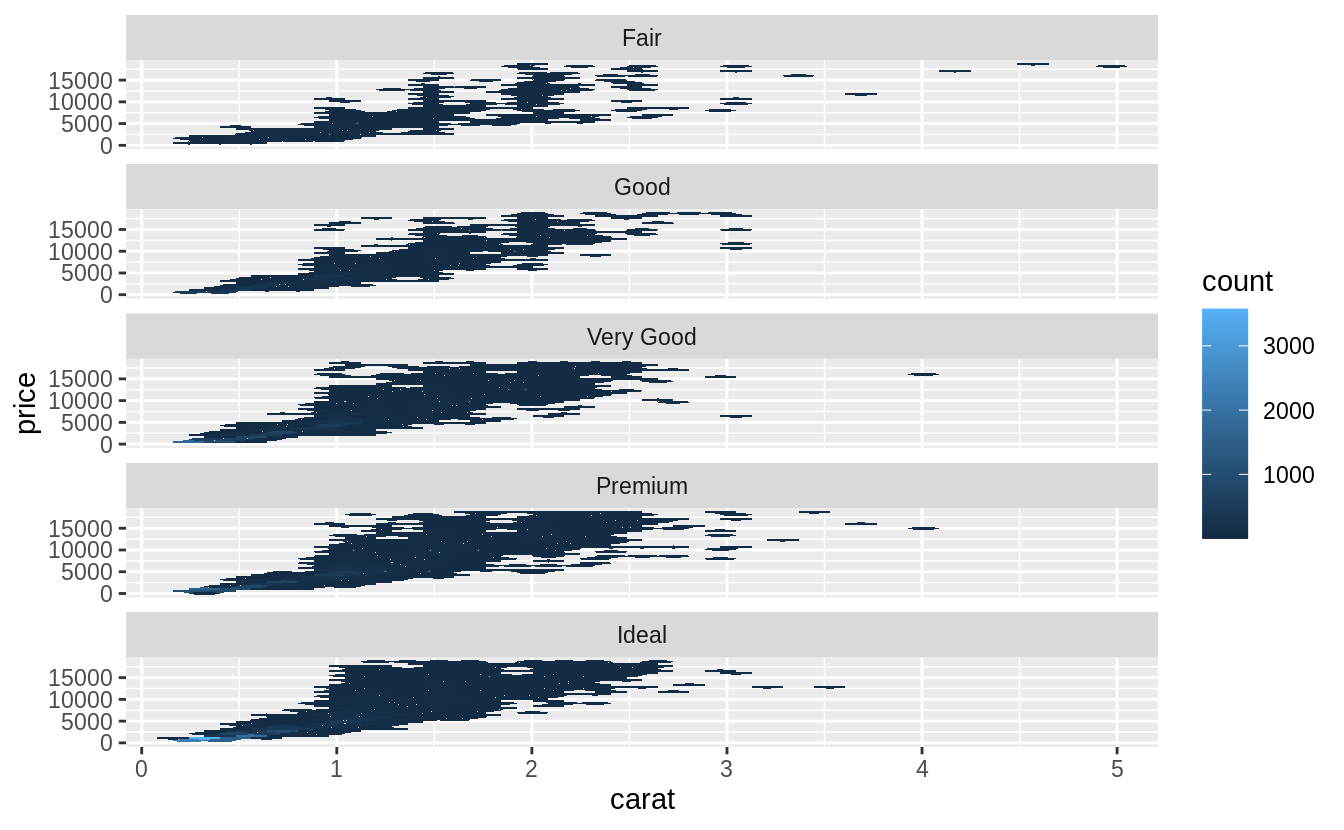
# the relationship between "cut" and "price"
ggplot(data = diamonds2) +
  geom_boxplot(mapping = aes(x = cut, y = resid))
# relative to their size, better quality diamonds are more expensive
# 然而我覺得以肉眼來看關係沒有很強......
在本書的後續章節(第二十二章至第二十五章)會針對建模做更深入的探討。
7.7 ggplot2 calls 即將離開以往的introductory chapters 前夕,針對往後使用到 ggplot2 package 程式碼的書寫,作者在此小節交代了與讀者們的默契:The first two arguments to ggplot() are data and mapping, and the first two arguments to aes() are x and y 以下兩塊等價的程式區塊為範例:
diamonds %>%
  count(color, cut)
#> # A tibble: 35 x 3
#>   color cut           n
#>   <ord> <ord>     <int>
#> 1 D     Fair        163
#> 2 D     Good        662
#> 3 D     Very Good  1513
#> 4 D     Premium    1603
#> 5 D     Ideal      2834
#> 6 E     Fair        224
#> # … with 29 more rows
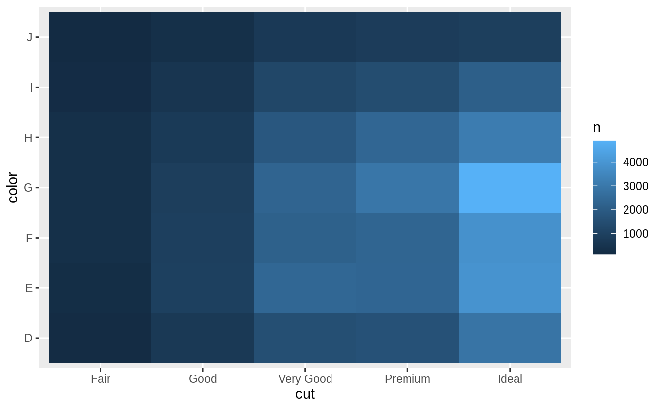
# show the distribution of cut within color

library(viridis)
diamonds %>%
  count(color, cut) %>%
  group_by(color) %>%
  mutate(prop = n / sum(n)) %>%
  ggplot(mapping = aes(x = color, y = cut)) +
  geom_tile(mapping = aes(fill = prop)) +
  scale_fill_viridis(limits = c(0, 1)) # from the viridis colour palette library
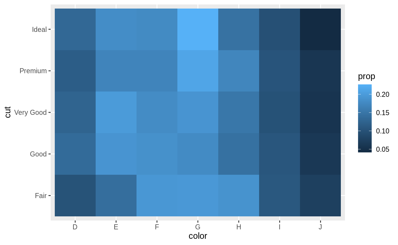
# show the distribution of color within cut
diamonds %>%
  count(color, cut) %>%
  group_by(cut) %>%
  mutate(prop = n / sum(n)) %>%
  ggplot(mapping = aes(x = color, y = cut)) +
  geom_tile(mapping = aes(fill = prop)) +
  scale_fill_viridis(limits = c(0, 1))
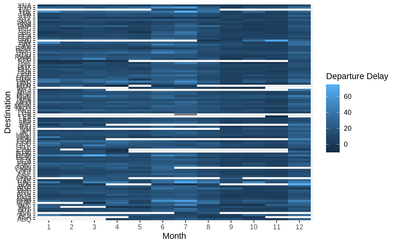
Use geom_tile() together with dplyr to explore how average flight delays vary by destination and month of year. What makes the plot difficult to read? How could you improve it?
# how average flight delays vary by destination and month of year?
library("nycflights13")
flights %>%
  group_by(month, dest) %>%
  summarise(dep_delay = mean(dep_delay, na.rm = TRUE)) %>%
  ggplot(aes(x = factor(month), y = dest, fill = dep_delay)) +
  geom_tile() +
  labs(x = "Month", y = "Destination", fill = "Departure Delay")
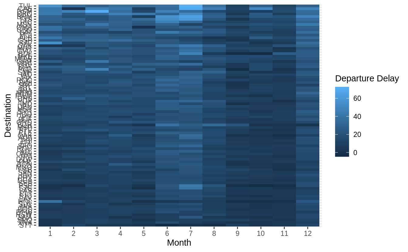
有三點可以改進上圖: 1. 將「dest」以有意義的方式排序分組(sorted),如依據飛行里程數、該地點降落班機數目、平均延遲時間……等等。 2. 移除遺漏值 ( missing value ) 3. 更好的 color schema (使用 viridis 包)
library("nycflights13")
library(viridis)
flights %>%
  group_by(month, dest) %>%
  summarise(dep_delay = mean(dep_delay, na.rm = TRUE)) %>%
# set (na.rm = TRUE) to remove missing value
  group_by(dest) %>%
  filter(n() == 12) %>%
# (84 different levels of "dest") * (sample size = 12)
  ungroup() %>%
  mutate(dest = reorder(dest, dep_delay)) %>%
  ggplot(aes(x = factor(month), y = dest, fill = dep_delay)) +
  geom_tile() +
  scale_fill_viridis() +
  labs(x = "Month", y = "Destination", fill = "Departure Delay")
當調整透明度也無法優化數據量大的散佈圖時,可以使用裝箱法 (bin,或譯組界、格子大小):以geom_bin2d() 和 geom_hex() 函數實作二維的裝箱 (bin in two dimensions)。 先前章節中我們使用過的geom_histogram() and geom_freqpoly() 則是一維的裝箱 (bin in one dimension)。
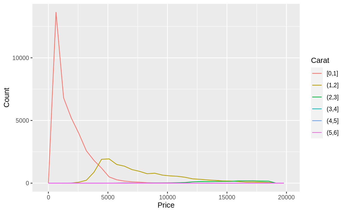
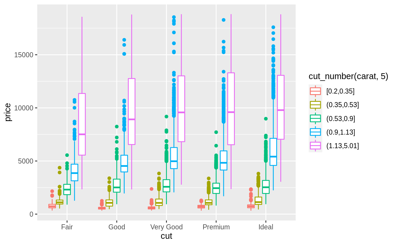
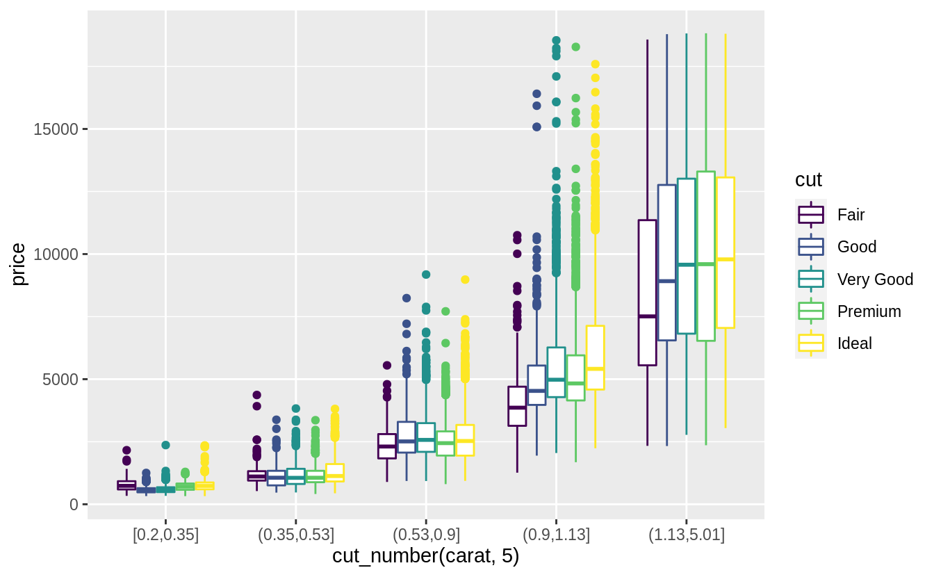
預設每個箱型圖都大小一致,以下方法可以讓箱型圖大小隨著箱型圖中所包含的觀察值數目同方向變化(make the width of the boxplot proportional to the number of points with varwidth = TRUE)。 或是使用cut_number() 函數:讓每個bin中的觀察值個數大約一致。
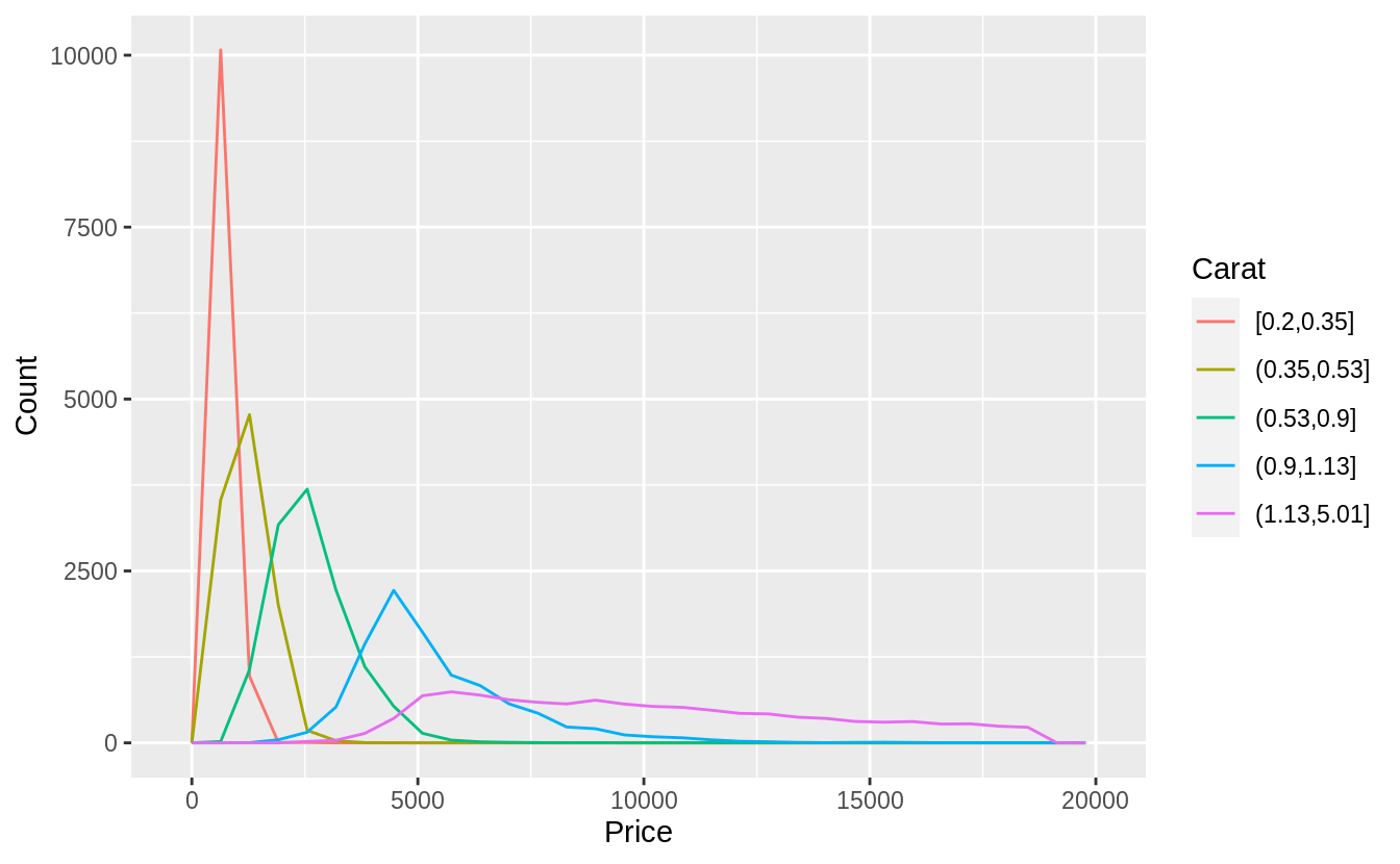
Visualize the distribution of carat, partitioned by price.
#Plotted with a box plot with 10 bins with an equal number of observations
ggplot(diamonds, aes(x = cut_number(price, 10), y = carat)) +
  geom_boxplot() +
  coord_flip() +
  xlab("Price")
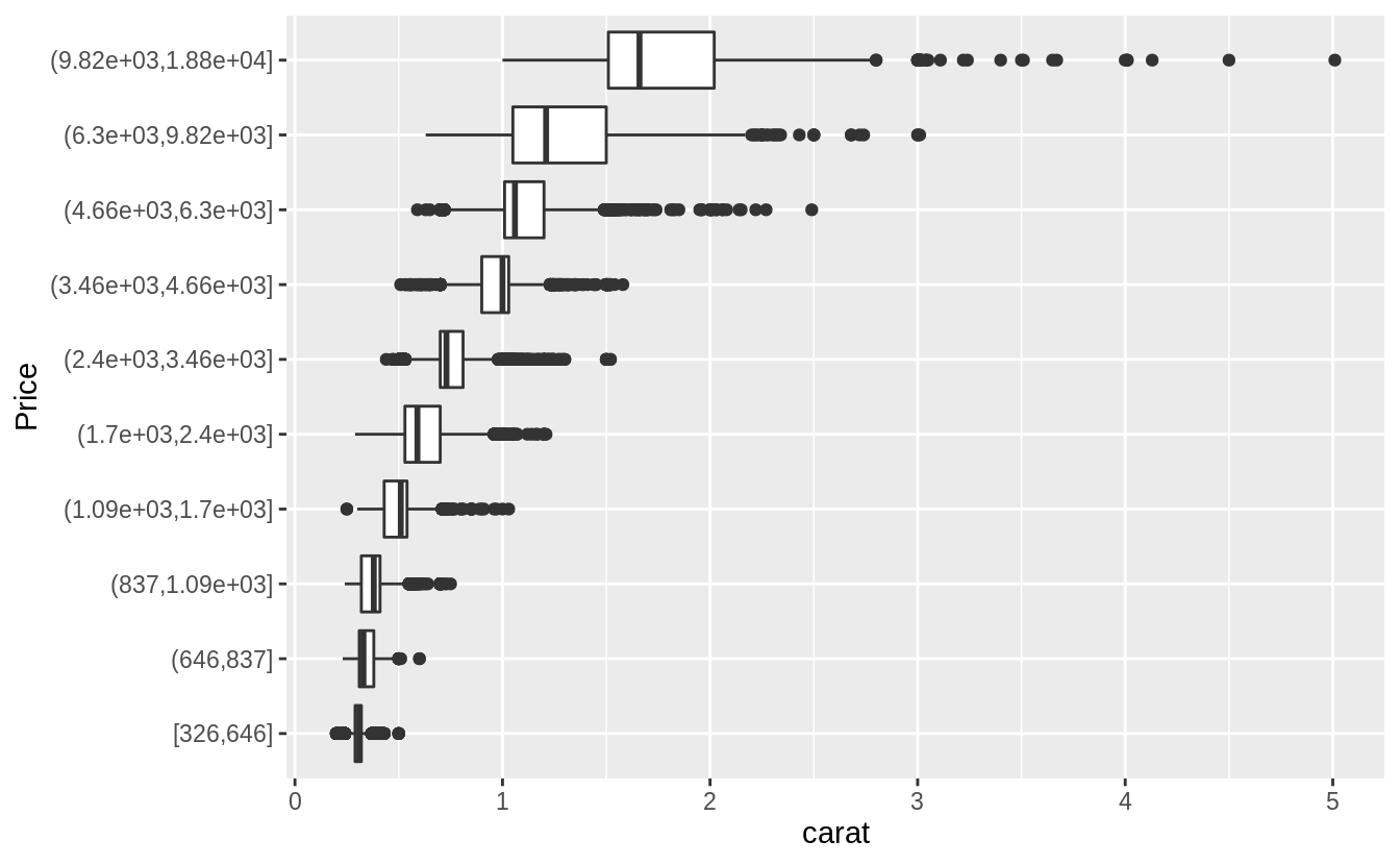
# The argument "boundary = 0" ensures that first bin is $0–$2,000.
# The argument "varwidth = TRUE"
# make the width of the boxplot proportional to the number of points. ---
ggplot(diamonds, aes(x = cut_width(price, 2000, boundary = 0), y = carat)) +
  geom_boxplot(varwidth = TRUE) +
  coord_flip() +
  xlab("Price")
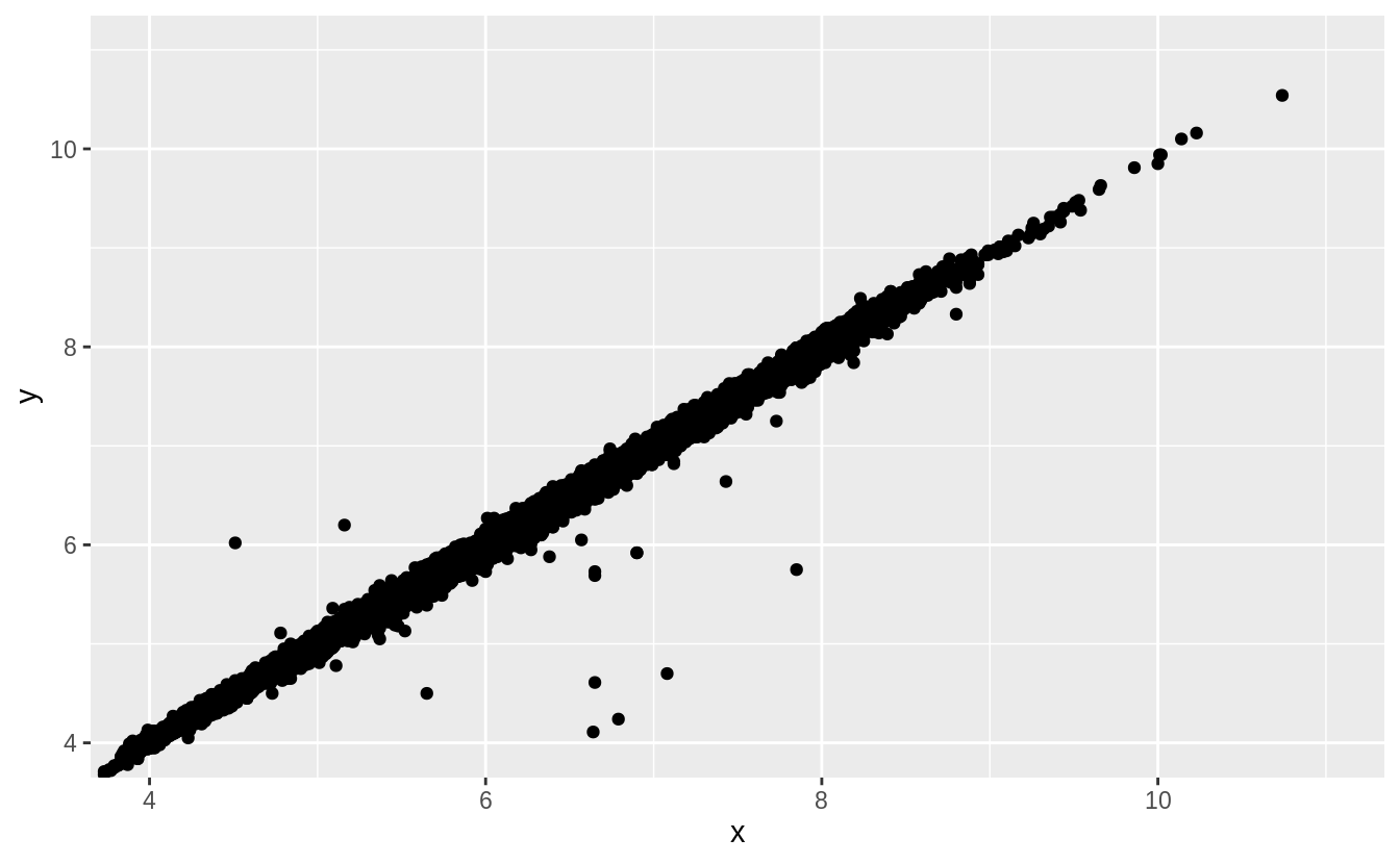
Two dimensional plots reveal outliers that are not visible in one dimensional plots. For example, some points in the plot below have an unusual combination of x and y values, which makes the points outliers even though their x and y values appear normal when examined separately.