7.3節談到outlier,7.4節接續介紹處理outlier的方法。
7.4 Missing values
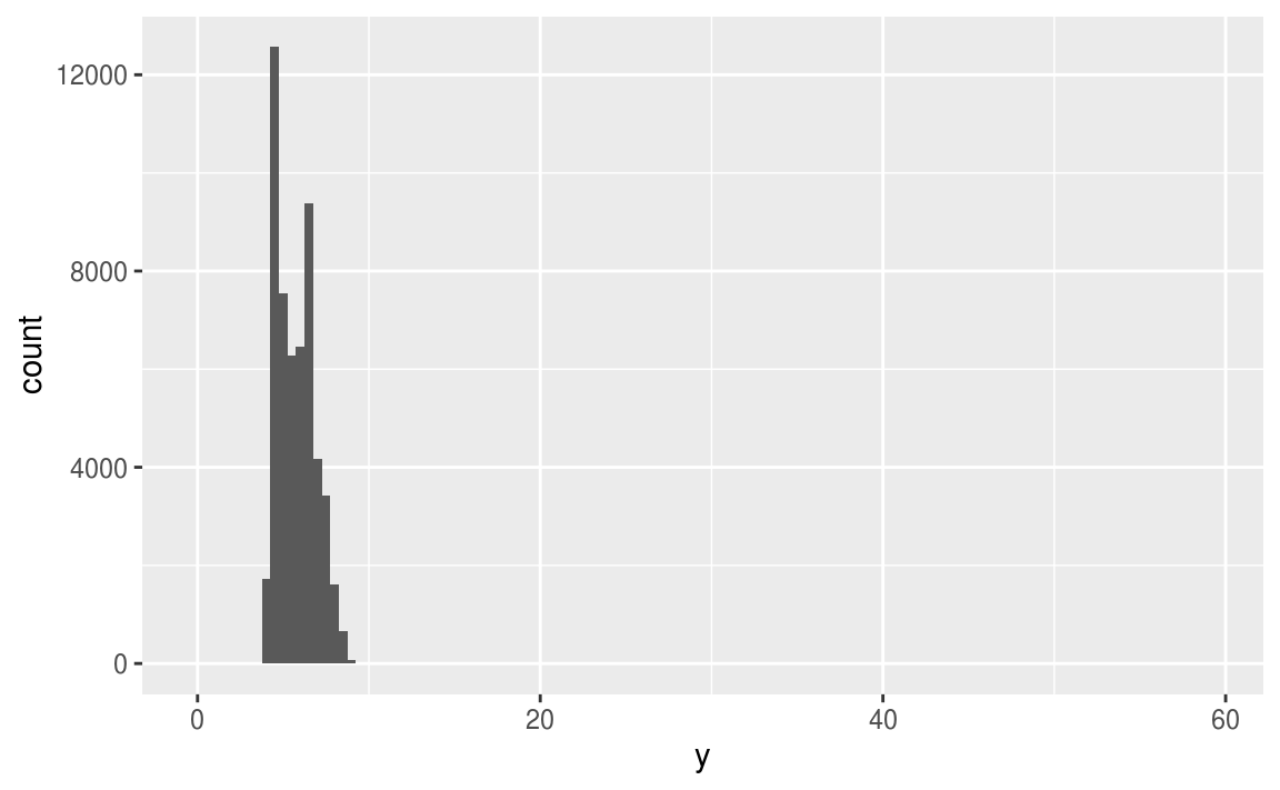
當在data set中出現異常值、離群值時,常用以下兩個方法解決:
- Drop the entire row with the strange values:
diamonds2 <- diamonds %>%
  filter(between(y, 3, 20))
作者並不建議直接將觀察值丟棄,因為一個觀察值的單一column是離群值,並不代表該觀察值的所有column都出現問題,而且會丟棄觀察值的作法會損失樣本。
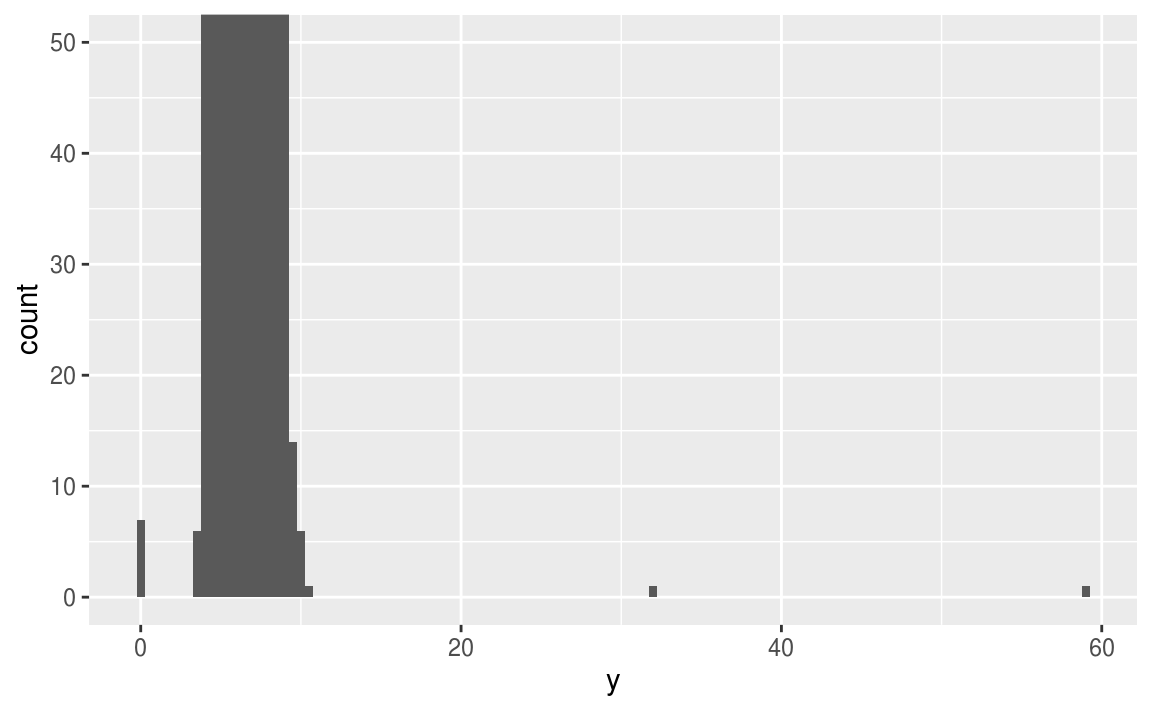
2. Instead, I recommend replacing the unusual values with missing values.
作者建議以遺漏值 (missing value) 置換unusual values,在 tidyverse 包中可以使用mutate() 函數加上 ifelse() 函數 或是 case_when() 函數實作。
diamonds2 <- diamonds %>%
  mutate(y = ifelse(y < 3 | y > 20, NA, y))
使用 ggplot2 繪圖時,會預設移除 missing value 再繪圖,但會跳出 warning 訊息。
ggplot(data = diamonds2, mapping = aes(x = x, y = y)) +
  geom_point()
#> Warning: Removed 9 rows containing missing values (geom_point).
如果要隱藏 warning message ,可以設定 na.rm = TRUE ,如以下程式碼:
ggplot(data = diamonds2, mapping = aes(x = x, y = y)) +
  geom_point(na.rm = TRUE)
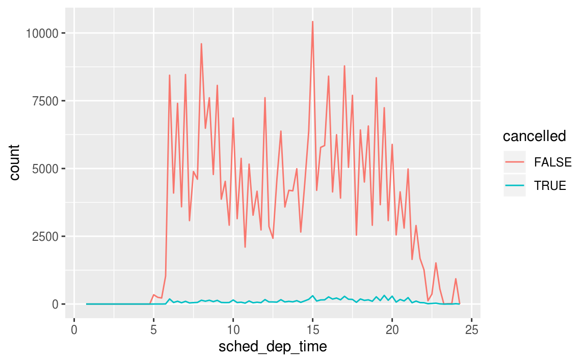
若需要觀察遺漏值,可以使用 is.na() 函數取出遺漏值,並繪圖觀察:
nycflights13::flights %>%
  mutate(
    cancelled = is.na(dep_time),
    sched_hour = sched_dep_time %/% 100,
    sched_min = sched_dep_time %% 100,
    sched_dep_time = sched_hour + sched_min / 60
  ) %>%
  ggplot(mapping = aes(sched_dep_time)) +
    geom_freqpoly(mapping = aes(colour = cancelled), binwidth = 1/4)
7.4.1 Exercises
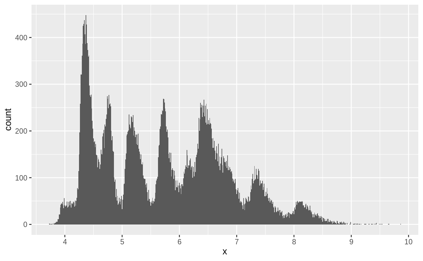
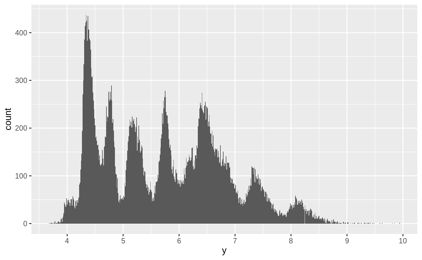
What happens to missing values in a histogram? What happens to missing values in a bar chart? Why is there a difference?
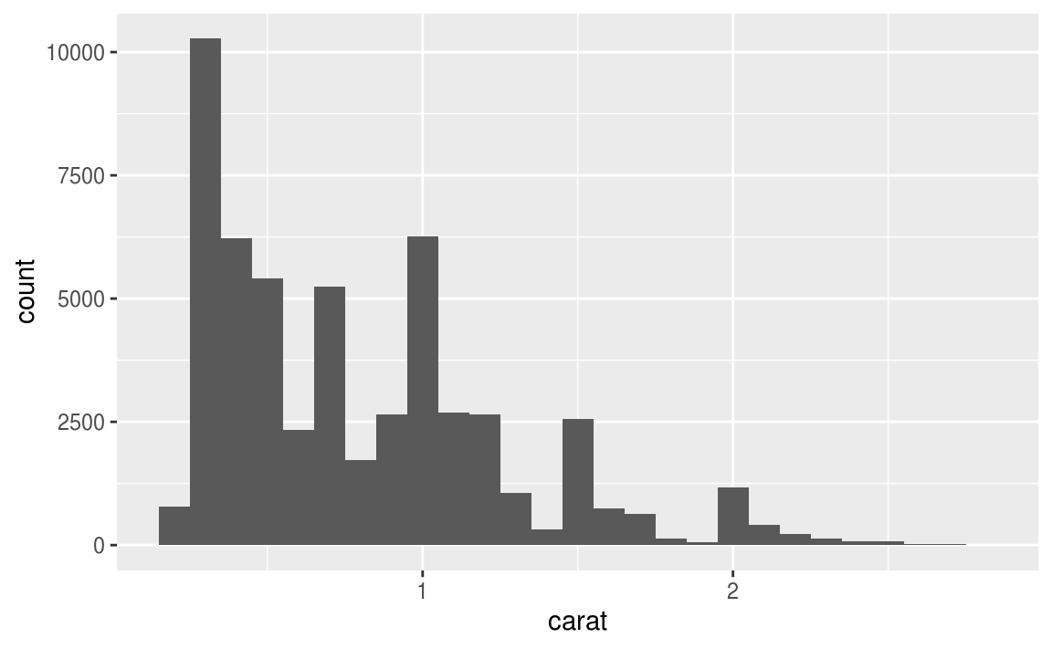
繪製直方圖時,預設就會移除遺漏值再進行繪圖:
# Missing values are removed when the number of observations
# in each bin are calculated.   ---
diamonds2 <- diamonds %>%
  mutate(y = ifelse(y < 3 | y > 20, NA, y))

ggplot(diamonds2, aes(x = y)) +
  geom_histogram()
#> `stat_bin()` using `bins = 30`. Pick better value with `binwidth`.
#> Warning: Removed 9 rows containing non-finite values (stat_bin).
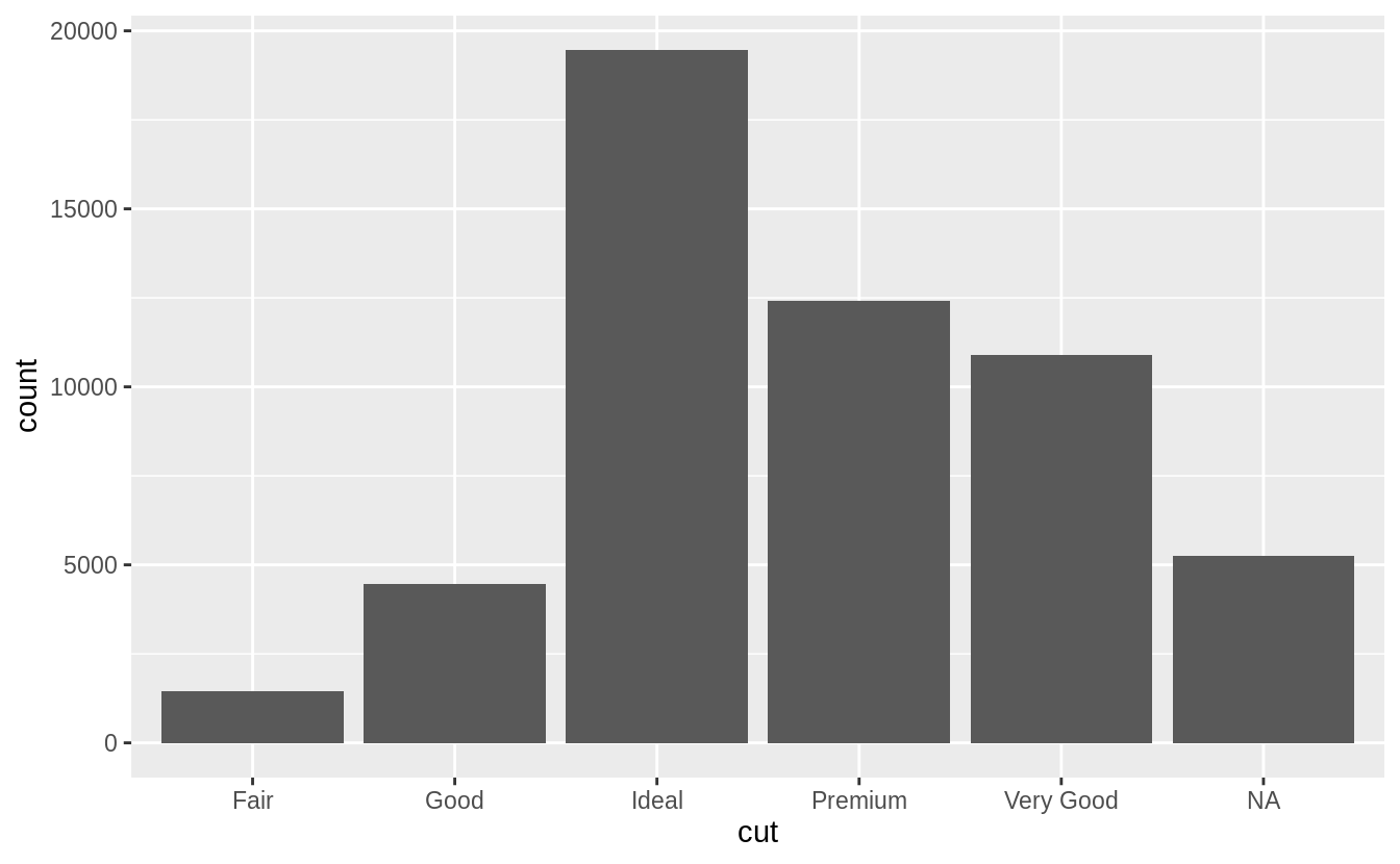
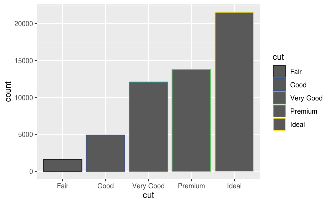
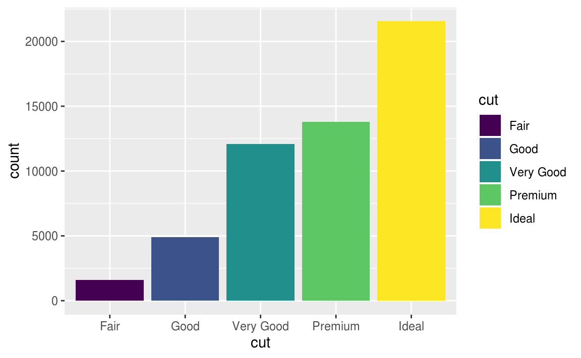
繪製長條圖時,遺漏值則會獨立成一個 group 顯示在長條圖上。
# In the geom_bar() function, NA is treated as another category.
diamonds %>%
  mutate(cut = if_else(runif(n()) < 0.1, NA_character_, as.character(cut))) %>%
  ggplot() +
  geom_bar(mapping = aes(x = cut))
Exercise 7.4.2
在sum() 和 mean() 中使用 na.rm = TRUE 會在運算前移除遺漏值。
mean(c(0, 1, 2, NA), na.rm = TRUE)
#> [1] 1
sum(c(0, 1, 2, NA), na.rm = TRUE)
#> [1] 3
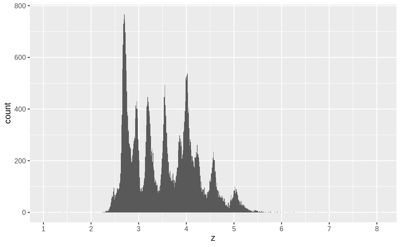
7.5 Covariation
變異數測量的是變數內的關係,而共變數測量的是變數之間的關係, Covariation is the tendency for the values of two or more variables to vary together in a related way. 觀察變異數最好的方法就是將變數們視覺化,變數的類型將決定使用何種視覺化方法。
7.5.1 A categorical and continuous variable
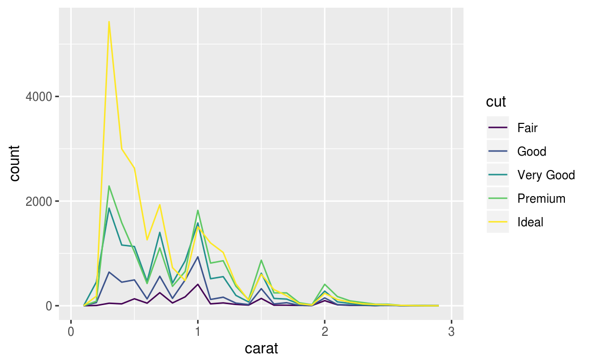
通常以 frequency polygon 作圖,但是預設的 geom_freqpoly() y 軸為count(計數),若在count數皆很小的組別,不容易看出組別之間的差距,不利於比較,以下為例子:
ggplot(data = diamonds, mapping = aes(x = price)) +
  geom_freqpoly(mapping = aes(colour = cut), binwidth = 500)
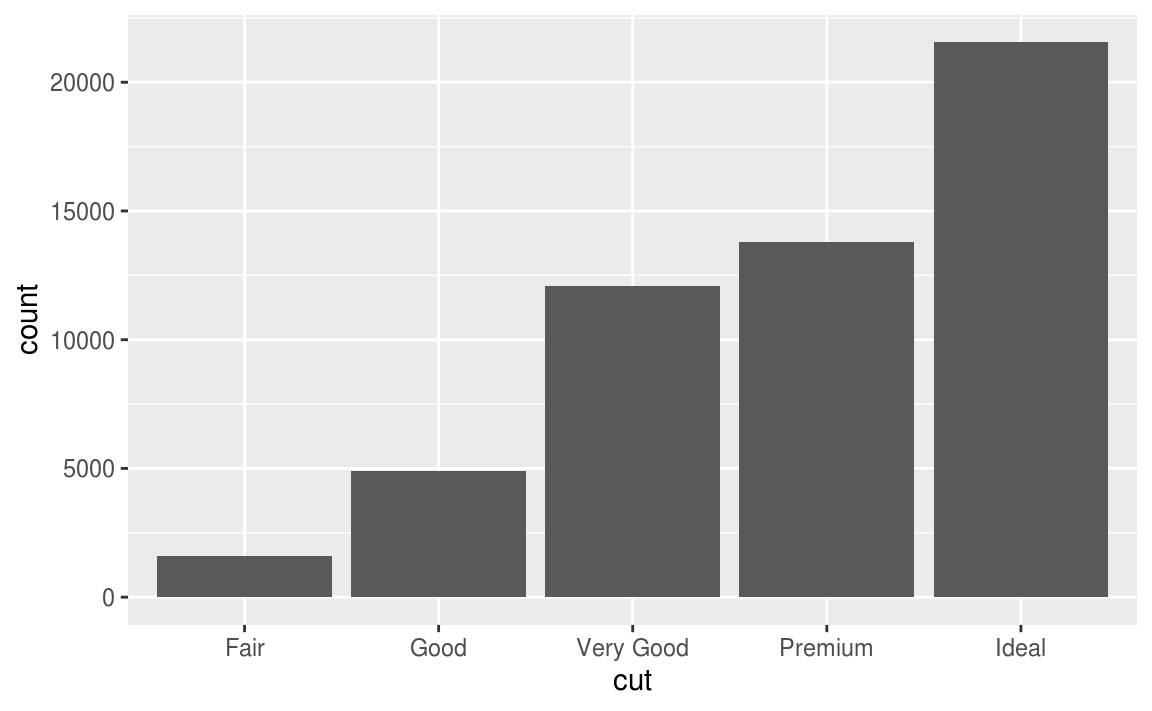
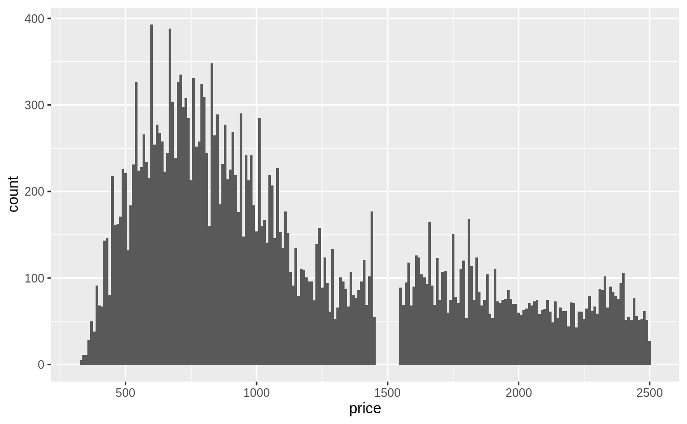
使用直方圖時,數據全距太大的情況下也難以辨認組別之間的差距,如以下例子:
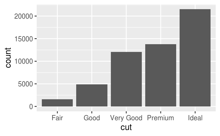
ggplot(diamonds) +
  geom_bar(mapping = aes(x = cut))
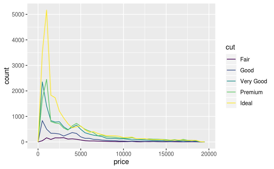
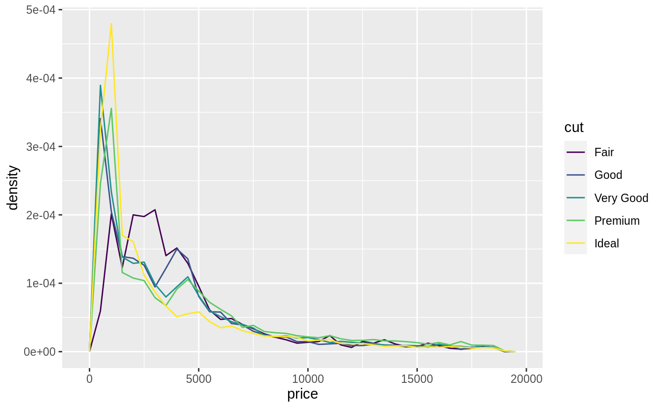
為了容易比較組別之間的差距,我們將縱軸 (y-axis) 設為機率密度 (density),density 為標準化後的總計數 (count standardised)。縱軸為機率密度的折線圖,每條折線之下的區域面積總和為 1。以下為縱軸為機率密度的折線圖:
# y-axis: replace count with density
ggplot(data = diamonds, mapping = aes(x = price, y = ..density..)) +
  geom_freqpoly(mapping = aes(colour = cut), binwidth = 500)

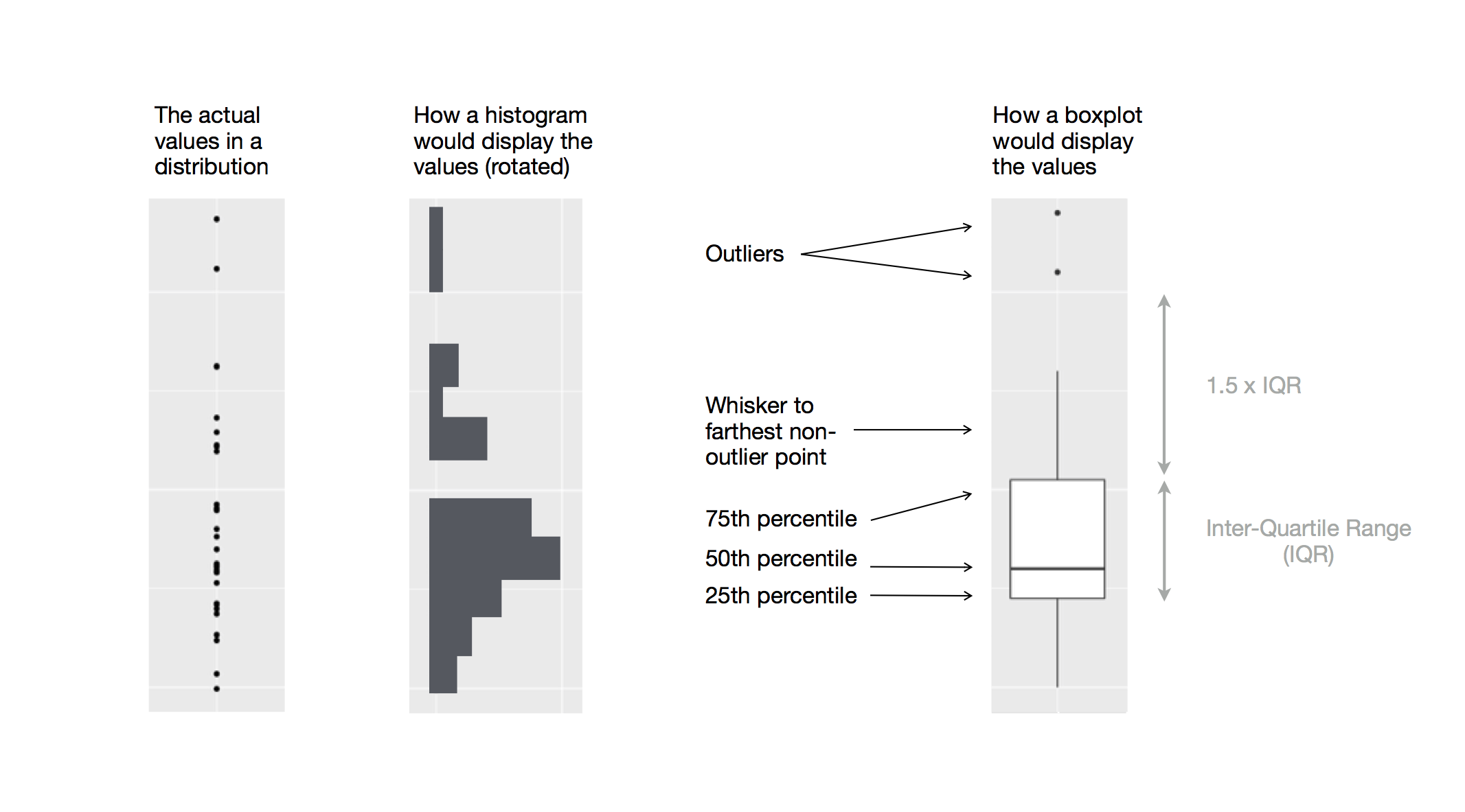
由以上的機率密度圖可看出,fair等級的鑽石「似乎」有最高的平均數,但折線圖其實不易判斷組別之間的中央趨勢,著我們再以箱型圖(boxplot)深入探索「a continuous variable broken down by a categorical variable」,以下圖片顯示箱型圖所能提供的資訊:
# using geom_boxplot() to plot boxplot
# "cut" is an ordered factor
ggplot(data = diamonds, mapping = aes(x = cut, y = price)) +
  geom_boxplot()
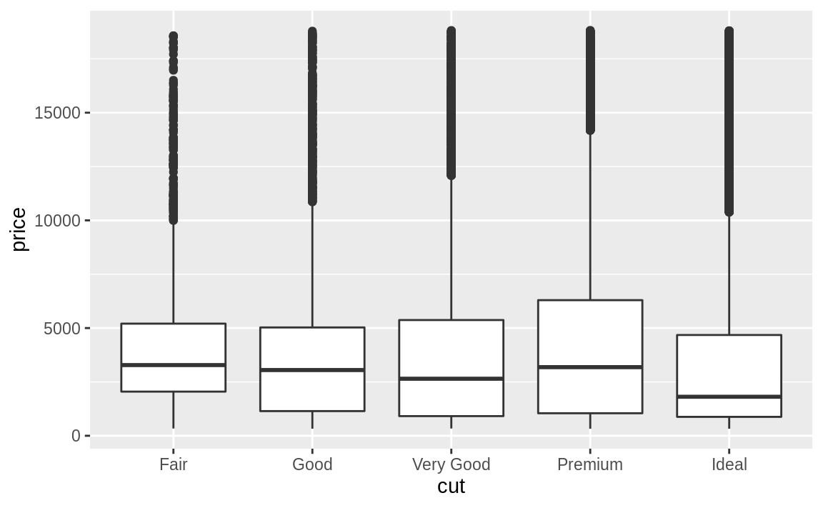
在上圖範例中, “cut" 變數本身有次序性。
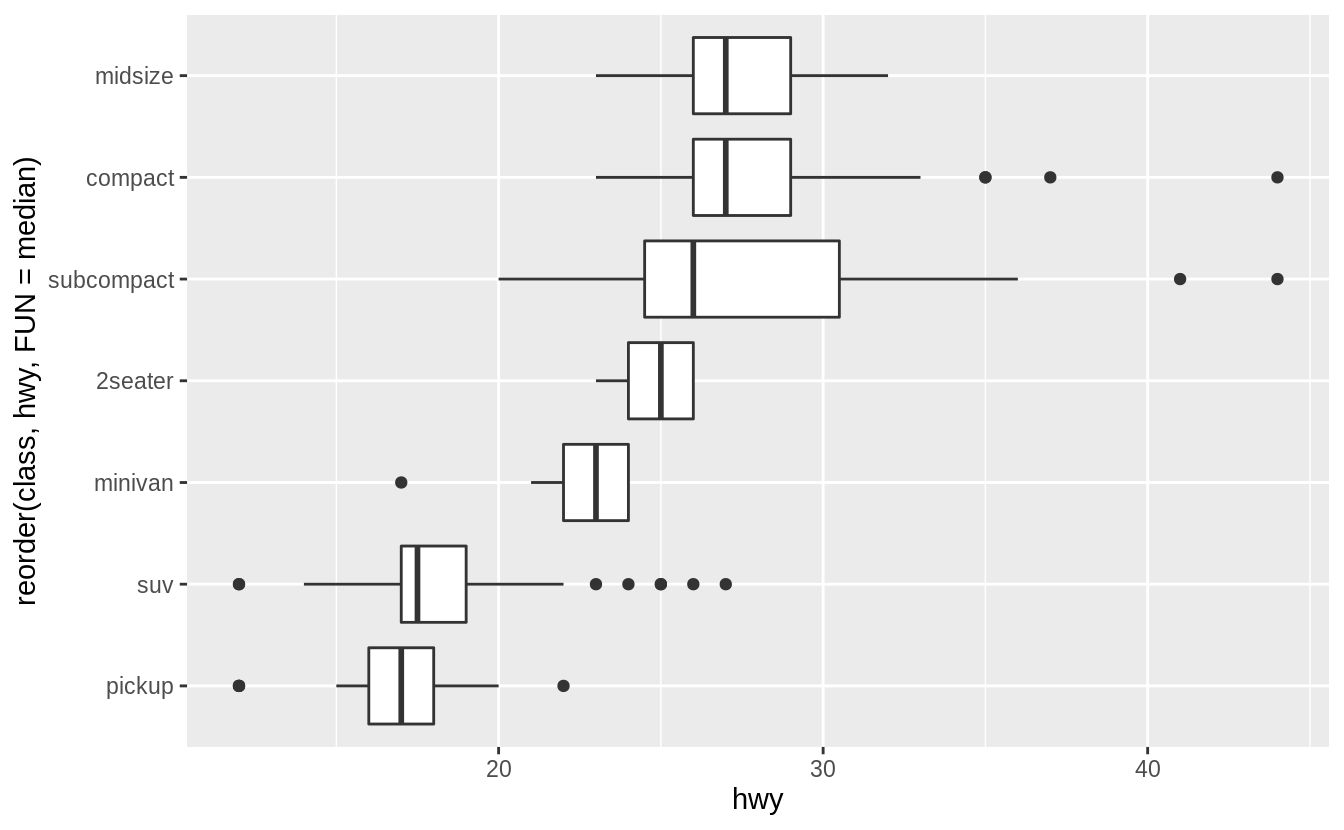
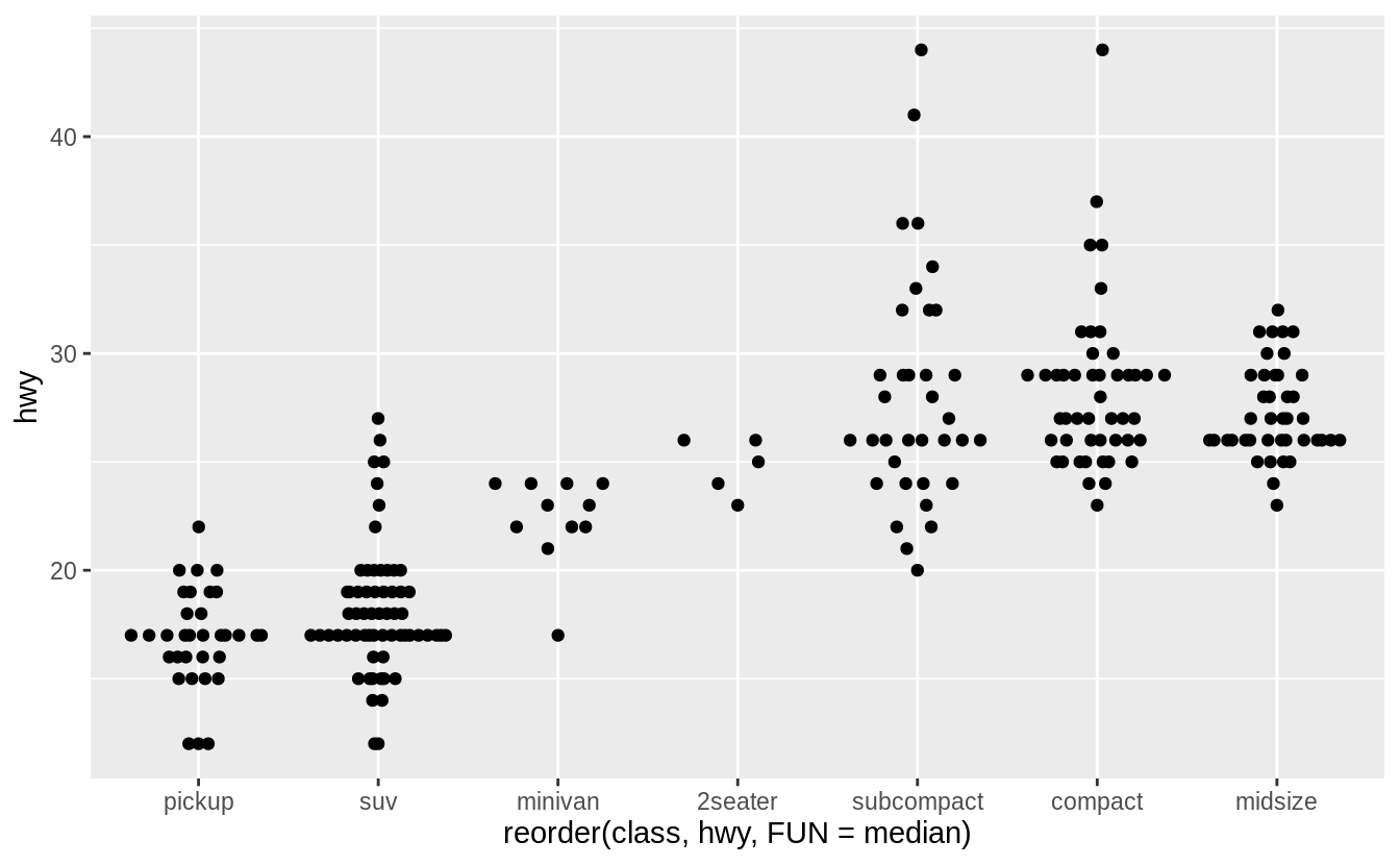
若用來繪製箱型圖的類別變數本身沒有次序性,我們可以使用 reorder() 函數將類別變數之下不同的 level 重新排序。
以下範例我們使用不同 level 之下資料點的中位數為重新排序的標準:
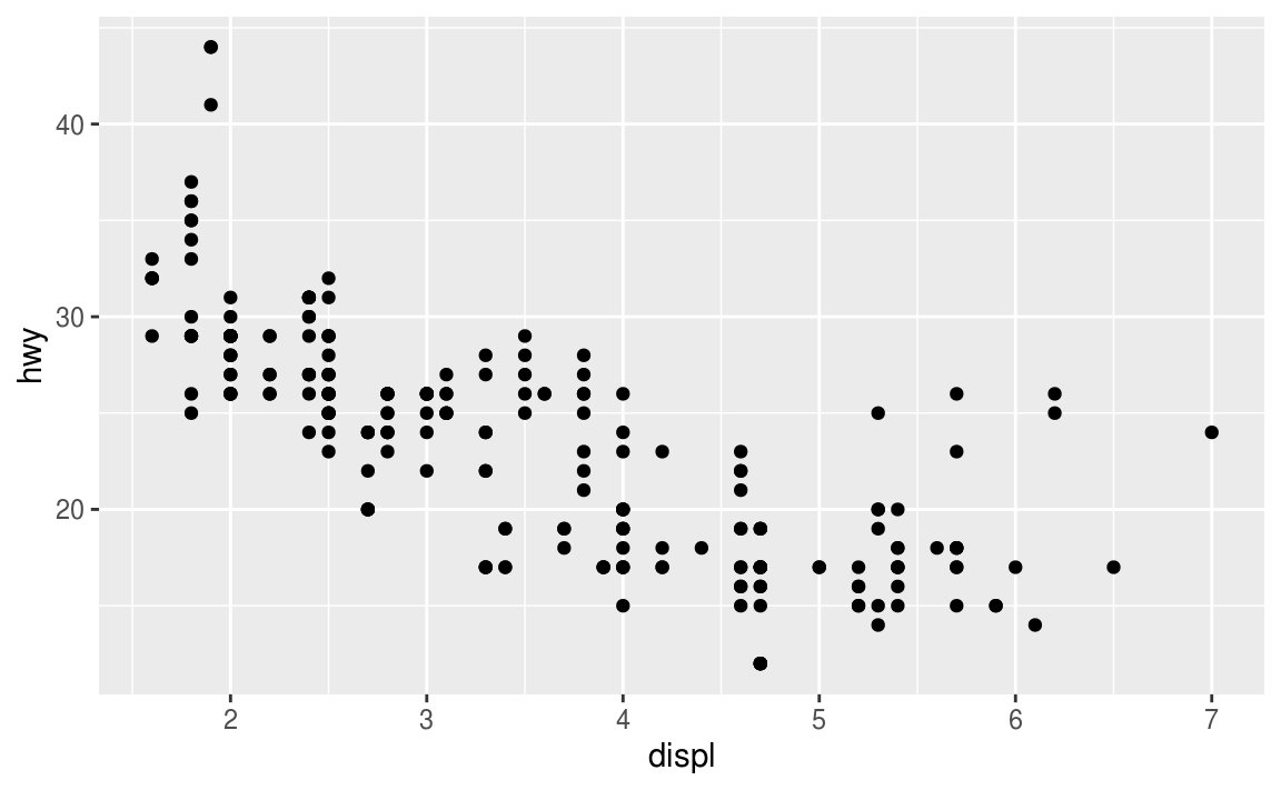
ggplot(data = mpg, mapping = aes(x = class, y = hwy)) +
  geom_boxplot()

# reorder() "class" with median of "hwy" at each level
ggplot(data = mpg) +
  geom_boxplot(mapping = aes(x = reorder(class, hwy, FUN = median), y = hwy))

# using coord_flip() to flip plot 90° to deal with long variable names
ggplot(data = mpg) +
  geom_boxplot(mapping = aes(x = reorder(class, hwy, FUN = median), y = hwy)) +
  coord_flip()

7.5.1.1 Exercises
Use the boxplot to improve the visualization of the departure times of cancelled vs. non-cancelled flights.
nycflights13::flights %>%
  mutate(
    cancelled = is.na(dep_time),
    sched_hour = sched_dep_time %/% 100,
    sched_min = sched_dep_time %% 100,
    sched_dep_time = sched_hour + sched_min / 60
  ) %>%
  ggplot() +
  geom_boxplot(mapping = aes(y = sched_dep_time, x = cancelled))

Exercise 7.5.1.2
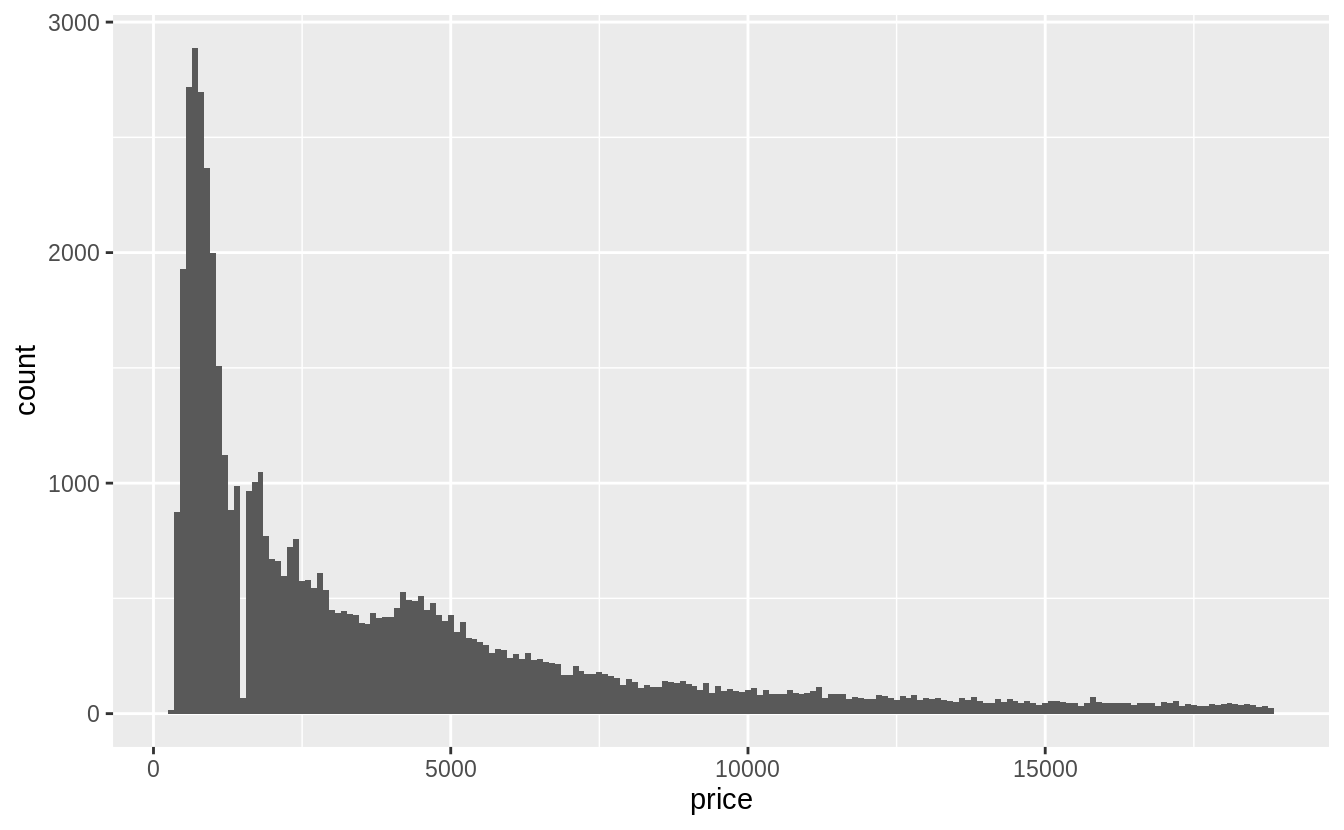
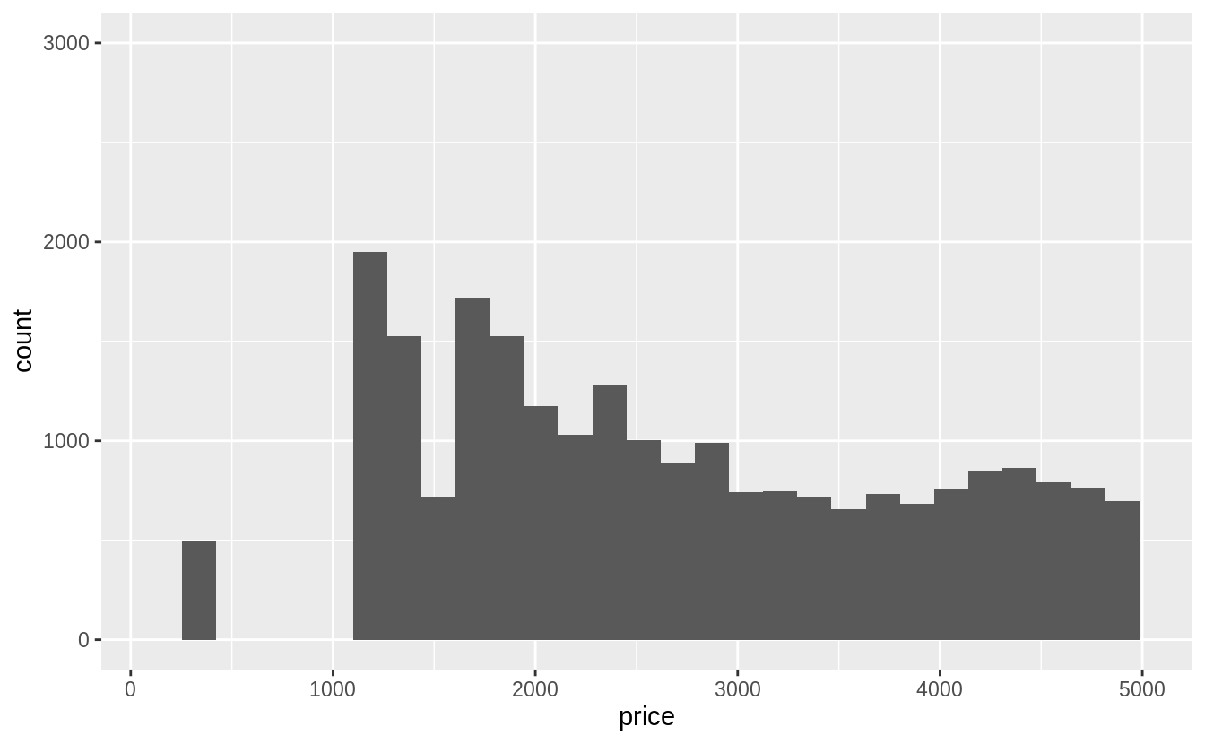
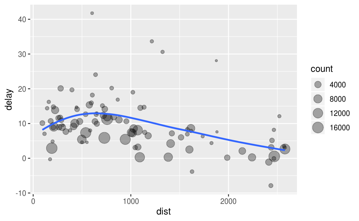
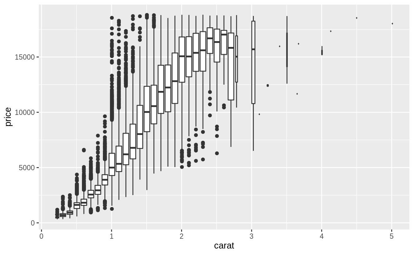
先針對第一個提問作圖:What variable in the diamonds dataset is most important for predicting the price of a diamond?
# Use a scatter plot to visualize relationship between "price" and "carat"
# scatter plot display relationship between two continuous variables
ggplot(diamonds, aes(x = carat, y = price)) +
  geom_point()
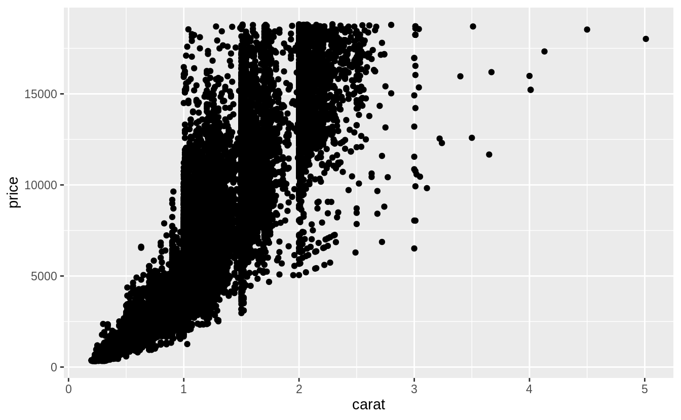
由上圖可以看出觀察值(資料點)個數非常多,以下我們使用「carat」這個變數裝箱(binning)後繪出散佈圖。使用裝箱法的散佈圖,其 binning width 數值的決定非常重要:數值設定太大,會遮蔽住變數間的關係;當數值設定的太小,每個bin中的樣本個數會成為多餘的變數以至於無法顯示整體趨勢。
ggplot(data = diamonds, mapping = aes(x = carat, y = price)) +
  geom_boxplot(mapping = aes(group = cut_width(carat, 0.1)))
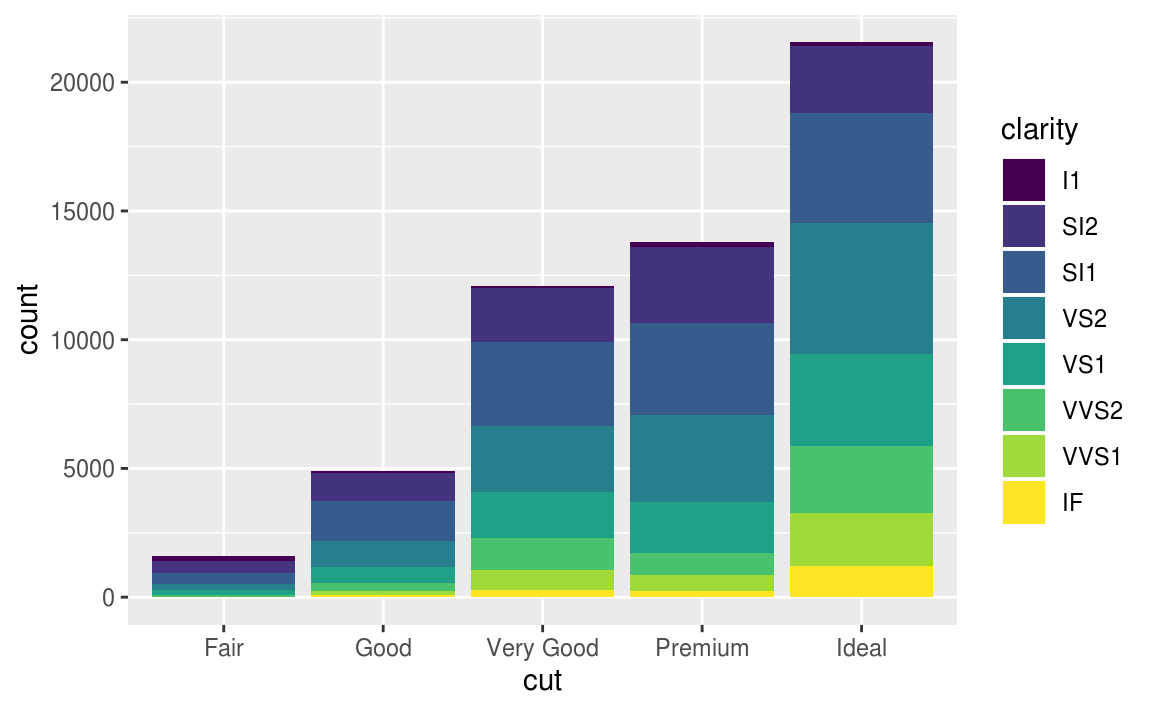
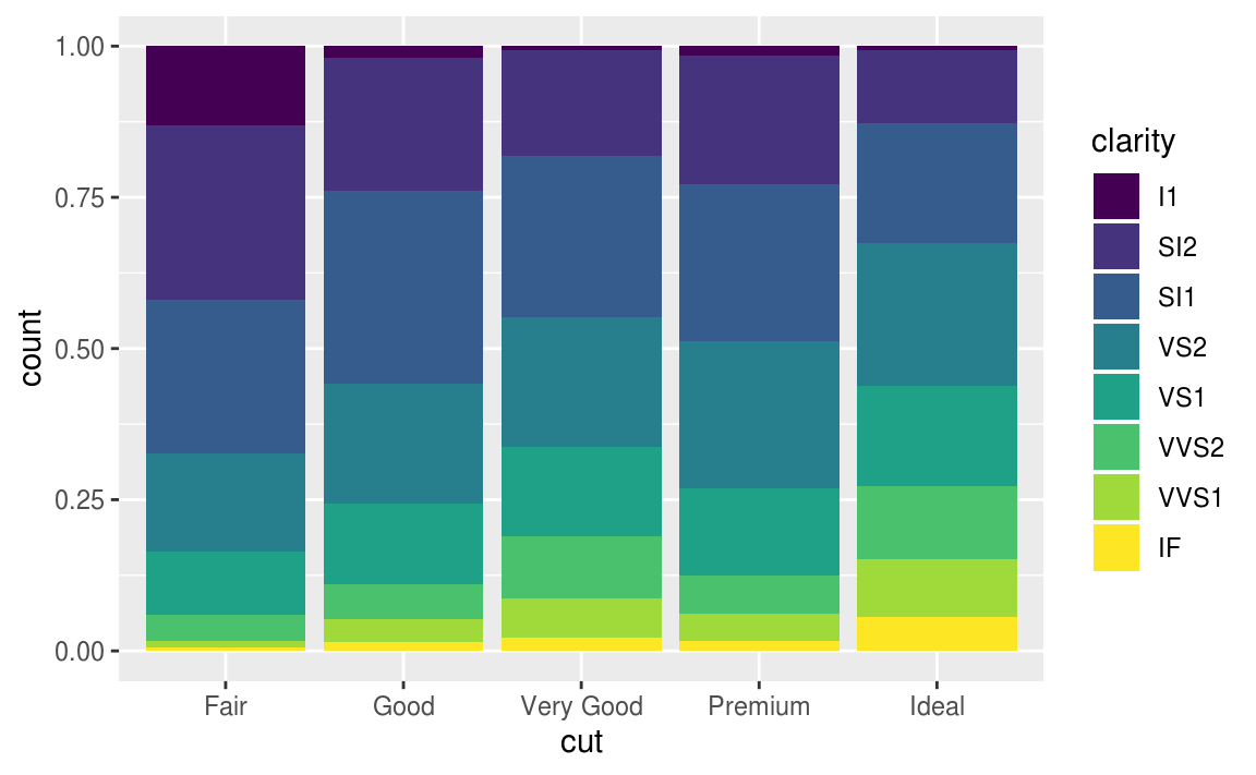
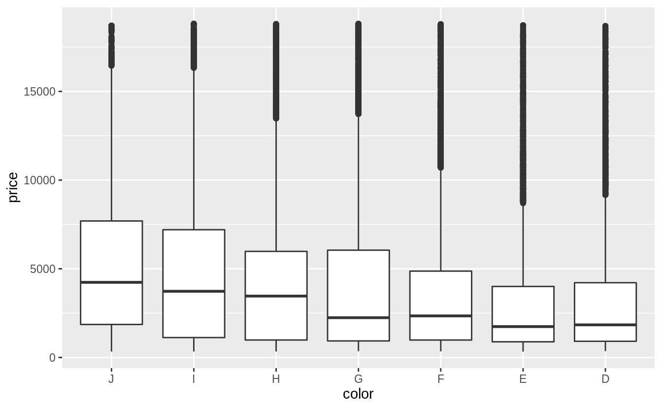
「color」和「clarity」屬於已排序的類別變數,作者使用 boxplot 描繪關係,作者認為箱型圖更容易觀察出兩個類別變數之間的關係。
# reverse the order of the color levels
# so they will be in increasing order of quality on the x-axis
# before plotting
diamonds %>%
  mutate(color = fct_rev(color)) %>%
  ggplot(aes(x = color, y = price)) +
  geom_boxplot()

# a weak negative relationship between "color" and "price"
# a weak negative relationship between "clarity" and "price"
# the scale of clarity goes from I1 (worst) to IF (best)
ggplot(data = diamonds) +
  geom_boxplot(mapping = aes(x = clarity, y = price))
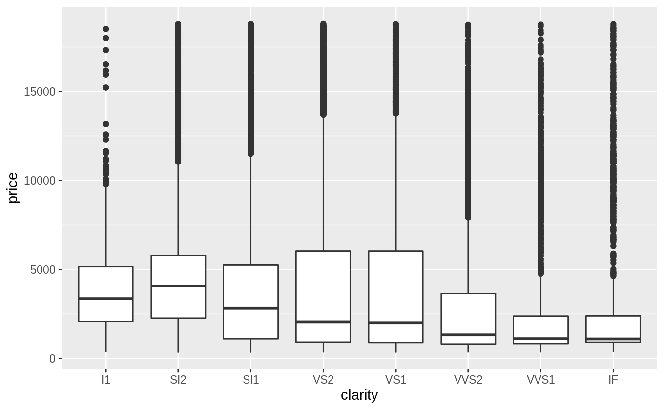
綜合以上三張圖可以發現,「clarity」和「color」這兩個自變數,其組內變異皆大於組間變異(變數之間的關係是否被組內變異抵銷),而「carat」是預測「price」較佳的自變數(the best predictor of price)。
再來,以箱型圖描繪「cut」與「carat」之間的關係:
ggplot(diamonds, aes(x = cut, y = carat)) +
  geom_boxplot()

由上圖可以看出,「cut」變數之下各 level 的組內變異數非常大,我們注意到:最大克拉數的鑽石有著最差等級的切割,而「cut」與「carat」之間有些微的負向關係。可能是因為大克拉數的鑽石只要普通甚至略差的切割工藝就能賣出,但是小克拉數的鑽石則需要較高等級的切割工藝才能賣出。
Exercise 7.5.1.3
Install the ggstance package, and create a horizontal box plot (水平箱型圖). How does this compare to using coord_flip()
以 geom_boxplot() 函數與 coord_flip() 函數製作的水平箱型圖如下:
ggplot(data = mpg) +
  geom_boxplot(mapping = aes(x = reorder(class, hwy, FUN = median), y = hwy)) +
  coord_flip()
# 畫出一般箱型圖再翻轉

以下程式區塊使用 ggstance 這個包繪製水平箱型圖:
library("ggstance")

ggplot(data = mpg) +
  geom_boxplot(mapping = aes(y = reorder(class, hwy, FUN = median), x = hwy))
# 直接指定橫軸與縱軸
Exercise 7.5.1.4
箱型圖適用於小樣本的資料集,以下介紹應用於大數據的箱型圖──Letter-Value Plots: Boxplots for Large Data ,letter-value plot 引入研究者自定義的順序統計量 “letter values",能夠更好地描述落在 Q1 與 Q4 之外的 tail behavior,一般來說,大數據相較於小樣本有以下特點:
1. Give precise estimates of quantiles(分位數) beyond the quartiles(四分位數).
(關於分位數、四分位數、百分位數)
2. Larger datasets should have more outliers ( in absolute numbers ).
在R語言中使用 lvplot 包中的geom_lv() 繪製Letter-Value Plots。
library("tidyverse")
library("lvplot")
ggplot(diamonds, aes(x = cut, y = price)) +
  geom_lv()
Exercise 7.5.1.5
Compare and contrast geom_violin() with a faceted geom_histogram(), or a colored geom_freqpoly(). What are the pros and cons of each method ?
著色的 geom_freqpoly() 利於快速查看整體趨勢,如以下範例,我們可以一眼看出「cut」之下的哪個 level 有最高的「price」,但折線間的重疊使我們難以區分整體分配與各組別間的關係(the overlapping lines makes it difficult to distinguish how the overall distributions relate to each other)。
geom_violin() 與 faceted geom_histogram() 有相似的優點和缺點:能用肉眼就了解各個 level 之下的資料長相(偏度、中央趨勢、離散趨勢等等);但是難以比較分配的縱軸數值,無法一眼看出「cut」之下的哪個 level 有最高的「price」。
以上三種繪圖函數呈現的分配形狀,皆涉及 parameters tuning。( All of these methods depend on tuning parameters to determine the level of smoothness of the distribution. )
以下是三種繪圖函數的程式碼與繪圖範例:
# geom_freqpoly()
ggplot(data = diamonds, mapping = aes(x = price, y = ..density..)) +
  geom_freqpoly(mapping = aes(color = cut), binwidth = 500)
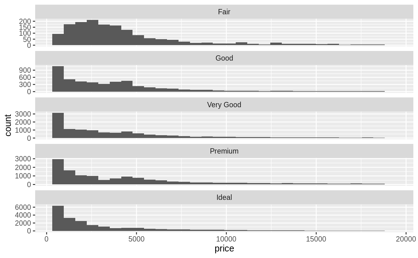
# faceted geom_histogram()
ggplot(data = diamonds, mapping = aes(x = price)) +
  geom_histogram() +
  facet_wrap(~cut, ncol = 1, scales = "free_y")
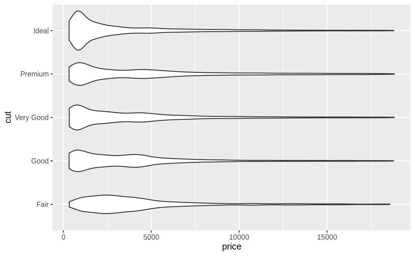
# geom_violin()
ggplot(data = diamonds, mapping = aes(x = cut, y = price)) +
  geom_violin() +
  coord_flip()
Exercise 7.5.1.6
在數據集屬於小樣本的情況下,geom_jitter() 可以讓連續型變數與類別變數間的關係更清楚,ggbeeswarm 包提供許多與geom_jitter() 函數功能相似的方法,如以下說明:
geom_quasirandom()produces plots that are a mix of jitter and violin plots. There are several different methods that determine exactly how the random location of the points is generated.geom_beeswarm()produces a plot similar to a violin plot, but by offsetting the points.