7.5.2 Two categorical variables
兩類別變數的視覺化,需要先計算各情況組合的累計數 (count),使用內建的geom_count() 函數實作此功能。
ggplot(data = diamonds) +
  geom_count(mapping = aes(x = cut, y = color))

上圖的資料點大小與觀察值個數成正比。
另一種方式呈現兩類別變數關係:先以dplyr 包計算總計數(count),再用geom_tile() 視覺化。
diamonds %>%
  count(color, cut)
#> # A tibble: 35 x 3
#>   color cut           n
#>   <ord> <ord>     <int>
#> 1 D     Fair        163
#> 2 D     Good        662
#> 3 D     Very Good  1513
#> 4 D     Premium    1603
#> 5 D     Ideal      2834
#> 6 E     Fair        224
#> # … with 29 more rows
diamonds %>%
  count(color, cut) %>%
  ggplot(mapping = aes(x = color, y = cut)) +
    geom_tile(mapping = aes(fill = n))

seriation 包可以同時 reorder 兩類別變數的行與列,d3heatmap 包 或 heatmaply 包可以進一步產生互動式圖表 ( interactive plots )。
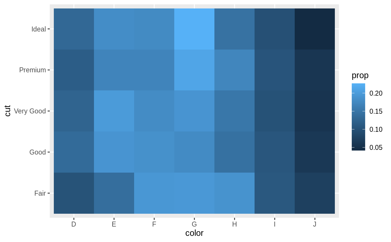
How could you rescale the count dataset above to more clearly show the distribution of cut within color, or color within cut?
先計算出「cut」變數之下每個 level 之下,每種 level 的 「color」所佔的比例,再以 geom_tile() 繪製 heatmap(???).
# show the distribution of cut within color

library(viridis)
diamonds %>%
  count(color, cut) %>%
  group_by(color) %>%
  mutate(prop = n / sum(n)) %>%
  ggplot(mapping = aes(x = color, y = cut)) +
  geom_tile(mapping = aes(fill = prop)) +
  scale_fill_viridis(limits = c(0, 1)) # from the viridis colour palette library
# show the distribution of color within cut
diamonds %>%
  count(color, cut) %>%
  group_by(cut) %>%
  mutate(prop = n / sum(n)) %>%
  ggplot(mapping = aes(x = color, y = cut)) +
  geom_tile(mapping = aes(fill = prop)) +
  scale_fill_viridis(limits = c(0, 1))
scale_fill_viridis(limits = c(0, 1)) 限制圖片比例介於零到一之間,這也是我們所知數學上比例的範圍,限制顯示單位方便跨圖片的比較,但可能不利於單一圖片內各 level 組合之間的比較;反之若使用預設尺度(顯示全距),則方便單一圖片內各 level 組合之間比較,但不利於跨圖片比較。
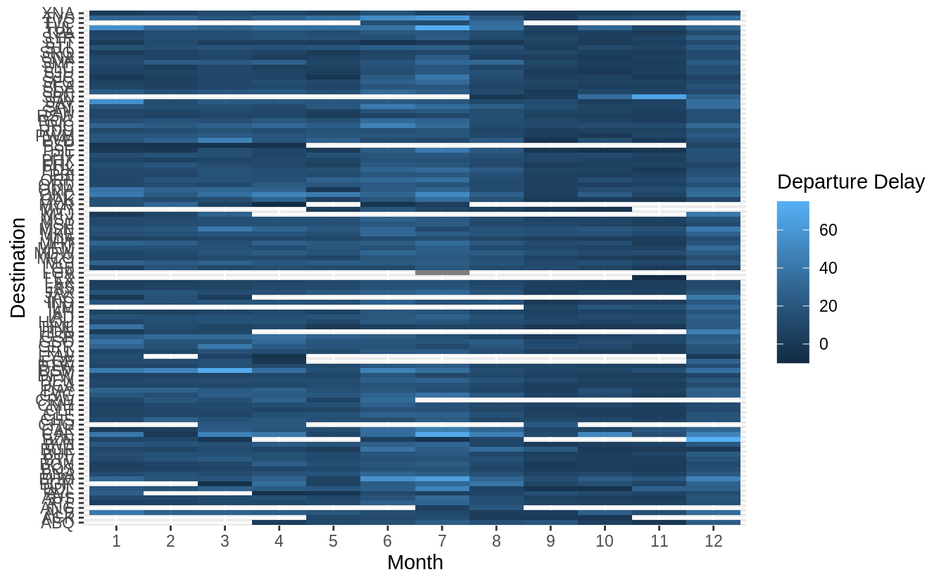
Usegeom_tile()together with dplyr to explore how average flight delays vary by destination and month of year. What makes the plot difficult to read? How could you improve it?
# how average flight delays vary by destination and month of year?
library("nycflights13")
flights %>%
  group_by(month, dest) %>%
  summarise(dep_delay = mean(dep_delay, na.rm = TRUE)) %>%
  ggplot(aes(x = factor(month), y = dest, fill = dep_delay)) +
  geom_tile() +
  labs(x = "Month", y = "Destination", fill = "Departure Delay")
有三點可以改進上圖:
1. 將「dest」以有意義的方式排序分組(sorted),如依據飛行里程數、該地點降落班機數目、平均延遲時間……等等。
2. 移除遺漏值 ( missing value )
3. 更好的 color schema (使用 viridis 包)
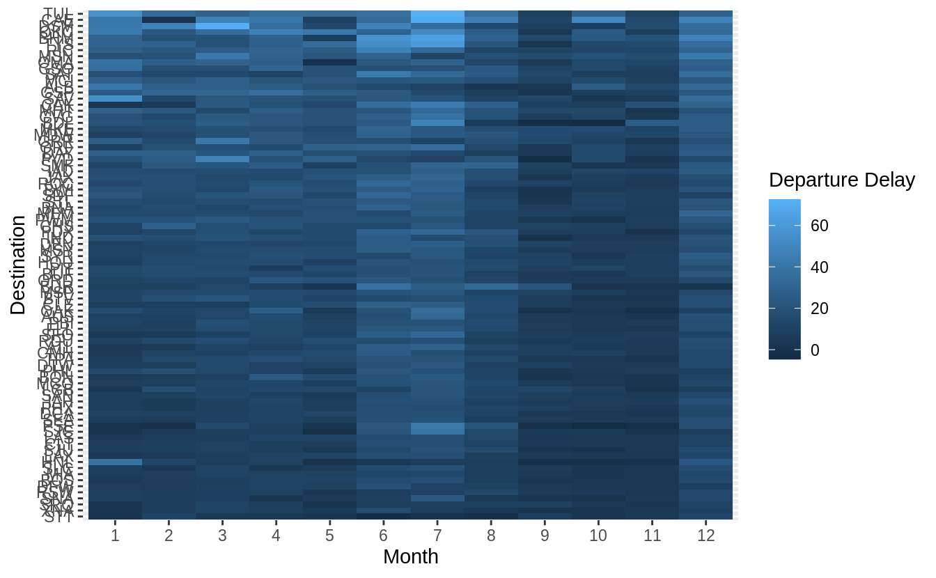
library("nycflights13")
library(viridis)
flights %>%
  group_by(month, dest) %>%
  summarise(dep_delay = mean(dep_delay, na.rm = TRUE)) %>%
# set (na.rm = TRUE) to remove missing value
  group_by(dest) %>%
  filter(n() == 12) %>%
# (84 different levels of "dest") * (sample size = 12)
  ungroup() %>%
  mutate(dest = reorder(dest, dep_delay)) %>%
  ggplot(aes(x = factor(month), y = dest, fill = dep_delay)) +
  geom_tile() +
  scale_fill_viridis() +
  labs(x = "Month", y = "Destination", fill = "Departure Delay")
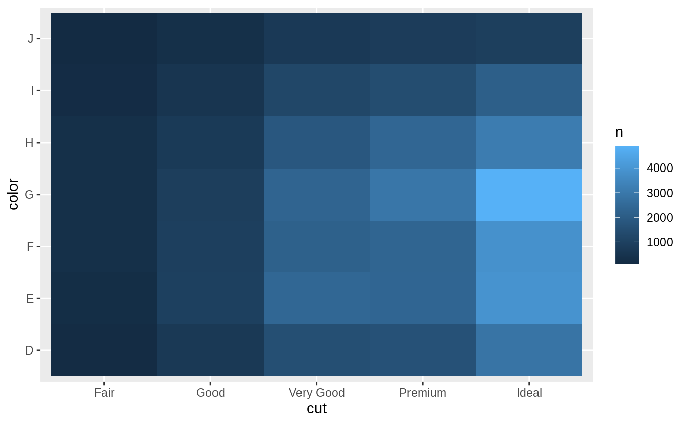
Why is it slightly better to use
aes(x = color, y = cut)rather thanaes(x = cut, y = color)in the example above?
通常我們會將類別個數 (level 數)較多的類別變數,或是類別名稱字數較長的類別變數放置在縱軸 (y-axis)。為了閱讀的方便性,在命名標籤不互相重疊的前提下,盡可能讓命名標籤(即,類別變數之下各個 level 名稱)以水平方向顯示。
# aes(x = cut, y = color)
diamonds %>%
  count(color, cut) %>%
  ggplot(mapping = aes(y = color, x = cut)) +
  geom_tile(mapping = aes(fill = n))
# aes(y = cut, x = color)
diamonds %>%
  count(color, cut) %>%
  ggplot(mapping = aes(x = color, y = cut)) +
  geom_tile(mapping = aes(fill = n))

7.5.3 Two continuous variables
我們可以使用散佈圖 (scatter plot) 描繪兩連續變數的關係,以geom_point() 函數繪製散佈圖。
ggplot(data = diamonds) +
  geom_point(mapping = aes(x = carat, y = price))

# an exponential relationship between "carat" and "price"

隨著數據量增大,散佈圖容易有 overplot 與 資料點堆積在某一特定區域的缺點,可以透過調整透明度,即設定 aesthetic 中的 alpha 數值來改進。
ggplot(data = diamonds) +
  geom_point(mapping = aes(x = carat, y = price), alpha = 1 / 100)

當調整透明度也無法優化數據量大的散佈圖時,可以使用裝箱法 (bin,或譯組界、格子大小):以geom_bin2d() 和 geom_hex() 函數實作二維的裝箱 (bin in two dimensions)。
先前章節中我們使用過的geom_histogram() and geom_freqpoly() 則是一維的裝箱 (bin in one dimension)。
geom_bin2d() 和 geom_hex() 函數會將座標平面分割成 2d bins,接著對 bins 填滿上色,bins 的顏色代表落在每一個 bin 中的資料點個數。geom_bin2d() 函數產生矩形bins;geom_hex() 函數產生六角形 bins,留意必須安裝hexbin 包才能使用geom_hex() 函數。
ggplot(data = smaller) +
  geom_bin2d(mapping = aes(x = carat, y = price))
# Error in ggplot(data = smaller) : object 'smaller' not found
# 遍尋不著 "smaller" 這個 dataset

# install.packages("hexbin")
ggplot(data = smaller) +
  geom_hex(mapping = aes(x = carat, y = price))
# Error in ggplot(data = smaller) : object 'smaller' not found


另一個方法是將其中一個連續型變數裝箱為類別變數,接著可以使用 7.5.1 章節的方法將兩變數視覺化。以下範例將「carat」bin 成類別變數後繪製箱型圖 ( boxplot )。
ggplot(data = smaller, mapping = aes(x = carat, y = price)) +
# 依舊找不到 smaller 這個 dataset
  geom_boxplot(mapping = aes(group = cut_width(carat, 0.1)))
# cut "carat" into bins of width = 0.1

預設每個箱型圖都大小一致,以下方法可以讓箱型圖大小隨著箱型圖中所包含的觀察值數目同方向變化(make the width of the boxplot proportional to the number of points with varwidth = TRUE)。
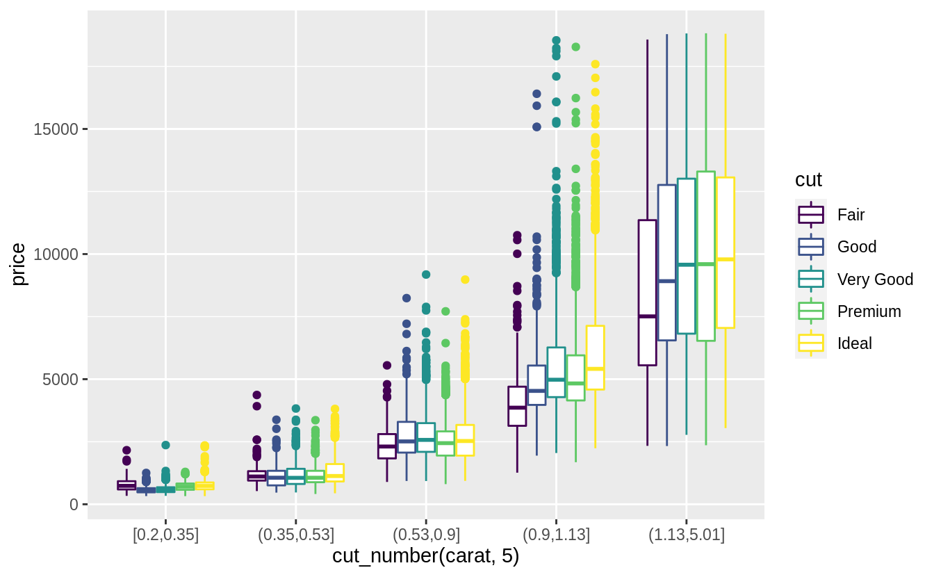
或是使用cut_number() 函數:讓每個bin中的觀察值個數大約一致。
ggplot(data = smaller, mapping = aes(x = carat, y = price)) +
  geom_boxplot(mapping = aes(group = cut_number(carat, 20)))

7.5.3.1 Exercises
比較cut_width() 與 cut_number() :這兩種函數都是用來將變數分割為多個group,使用cut_width() 函數,需要設定間距 (width),每個 bin 中的觀察值個數則是會被自動設定;使用cut_number() 時,需要設定組別數,間距則會被自動設定。
當 width 與 number 設定值越大時,越助於匯集觀察值以消弭噪音 (aggregate observations to remove noise),但需要注意設定值過大時會使所有訊號消失。
繪圖時若以不同顏色代表不同組別時,注意一張圖中不要超過八種顏色以利肉眼辨識。
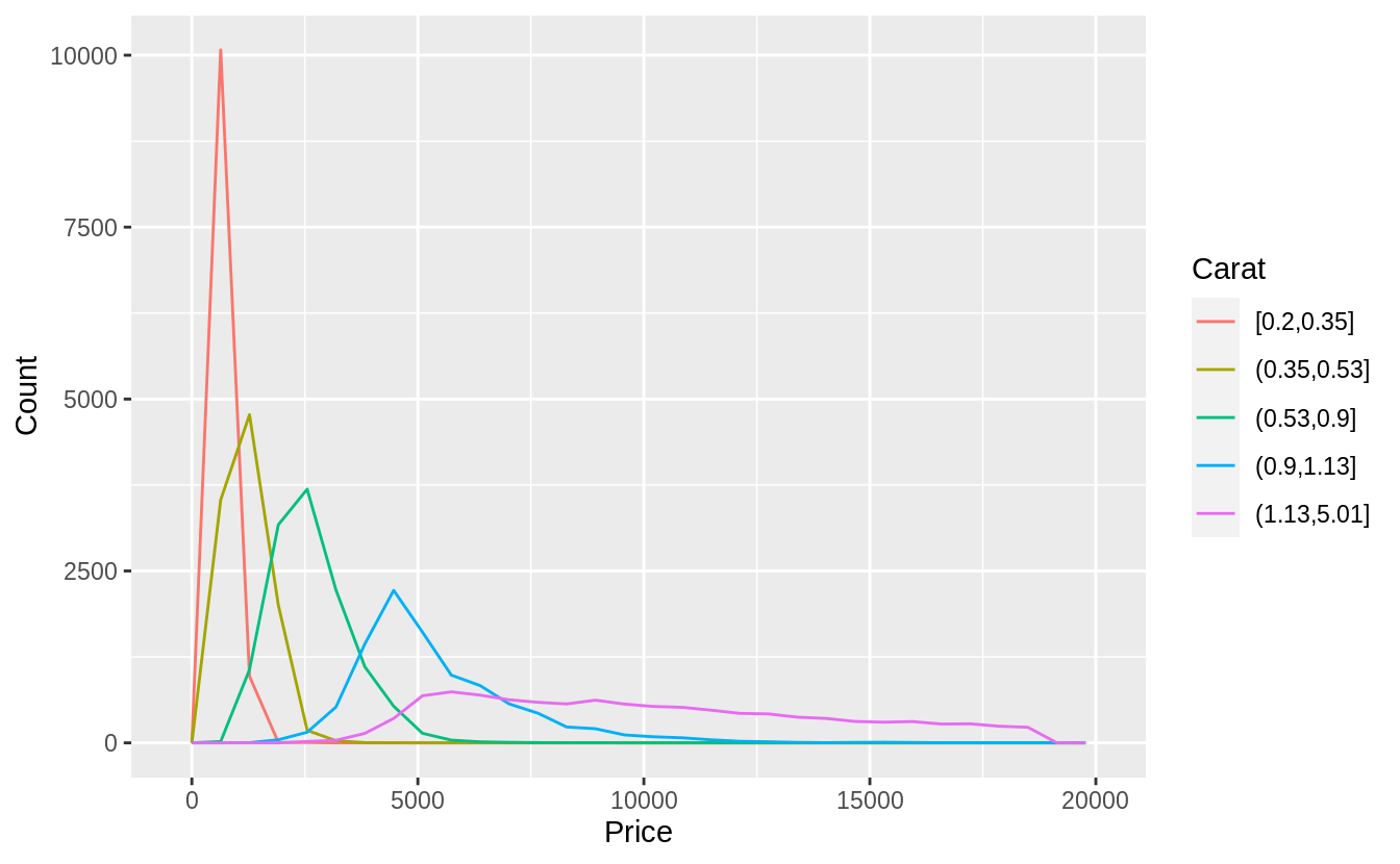
以下使用cut_number()函數,將「carat」分成五組:
ggplot(
  data = diamonds,
  mapping = aes(color = cut_number(carat, 5), x = price)
) +
  geom_freqpoly() +
  labs(x = "Price", y = "Count", color = "Carat")
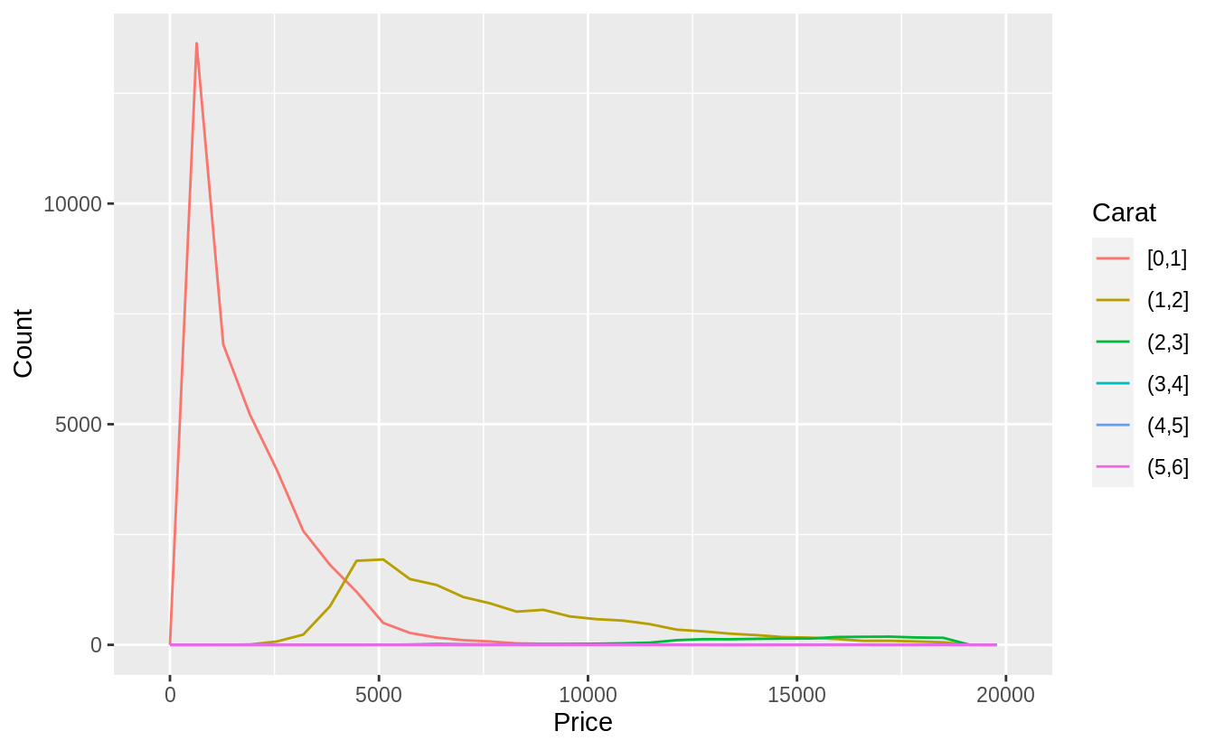
下面程式區塊則是使用cut_width()函數,由於間距若設定0.5,則有太多分組數,且超過 2 carat 的觀察值個數不多,我們設定間距為 1-carat widths.
ggplot(
  data = diamonds,
  mapping = aes(color = cut_width(carat, 1, boundary = 0), x = price)
) +
  geom_freqpoly() +
  labs(x = "Price", y = "Count", color = "Carat")
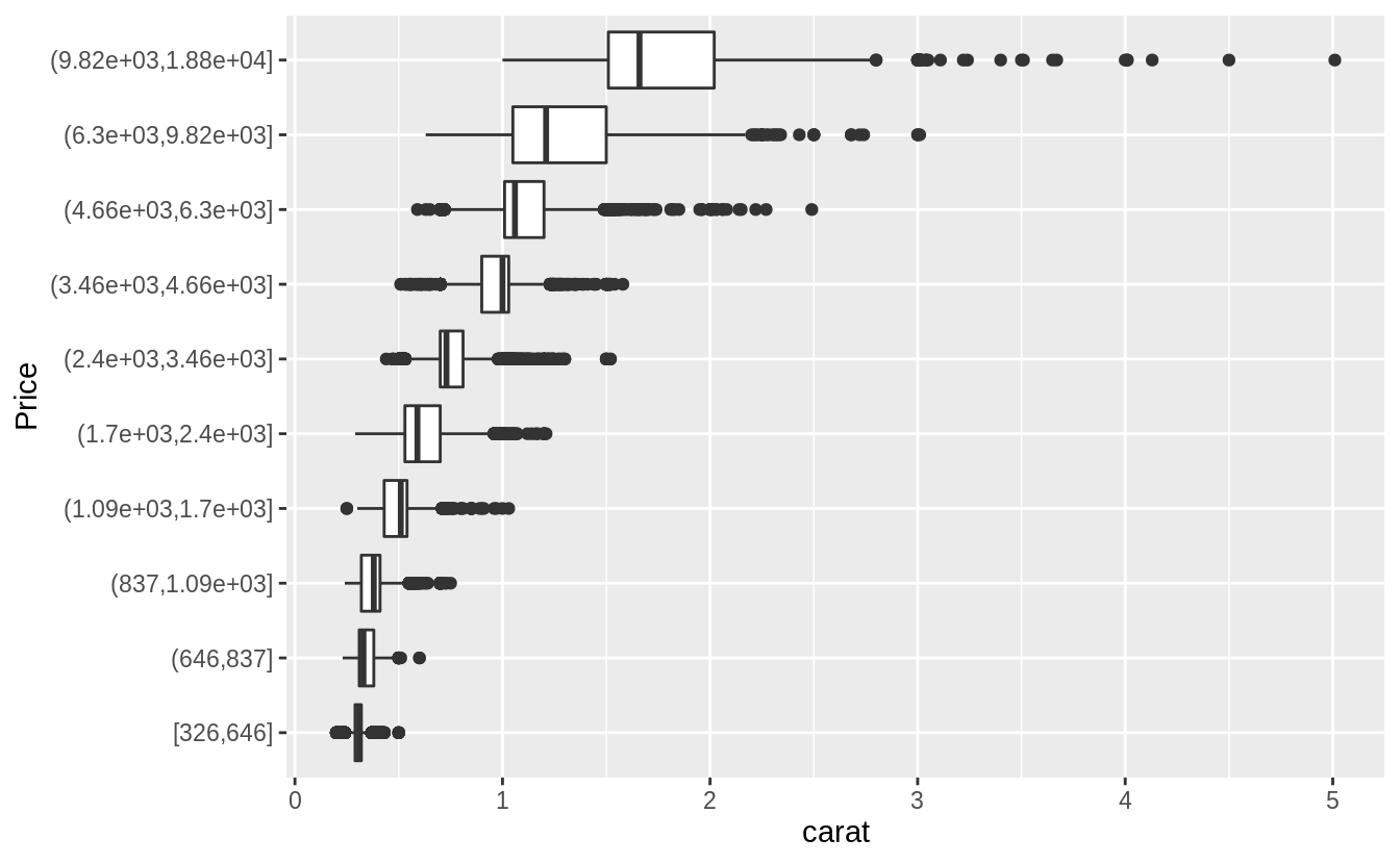
Visualize the distribution of
carat, partitioned byprice.
#Plotted with a box plot with 10 bins with an equal number of observations
ggplot(diamonds, aes(x = cut_number(price, 10), y = carat)) +
  geom_boxplot() +
  coord_flip() +
  xlab("Price")
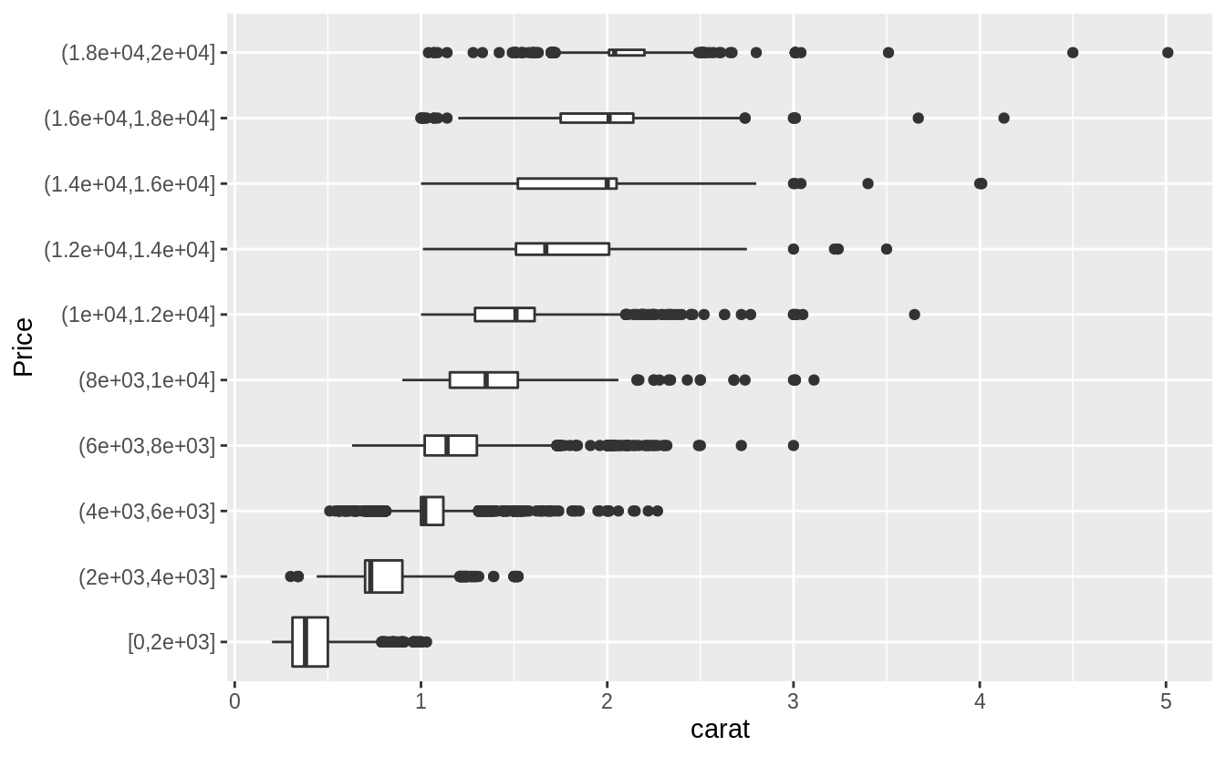
# The argument "boundary = 0" ensures that first bin is $0–$2,000.
# The argument "varwidth = TRUE"
# make the width of the boxplot proportional to the number of points. ---
ggplot(diamonds, aes(x = cut_width(price, 2000, boundary = 0), y = carat)) +
  geom_boxplot(varwidth = TRUE) +
  coord_flip() +
  xlab("Price")
Exercise 7.5.3.3
觀察範例 7.5.3.1的兩張折線圖,可以看出大克拉數(carat )的鑽石相較小克拉數的鑽石,在價格上有更大的分散趨勢(變異程度更大,more variable),可能是因為小克拉數鑽石必須在切割工藝 (cut)、淨度 (clarity)、顏色 (color) 上達到一定水準才賣得出去,所以小克拉鑽石的同質性相較大克拉鑽石更高。大克拉鑽石本身條件就比較有利可圖,因此在切割工藝、淨度、顏色等其他條件(自變數)上參差不齊(more variable)。
*****Exercise 7.5.3.4*****
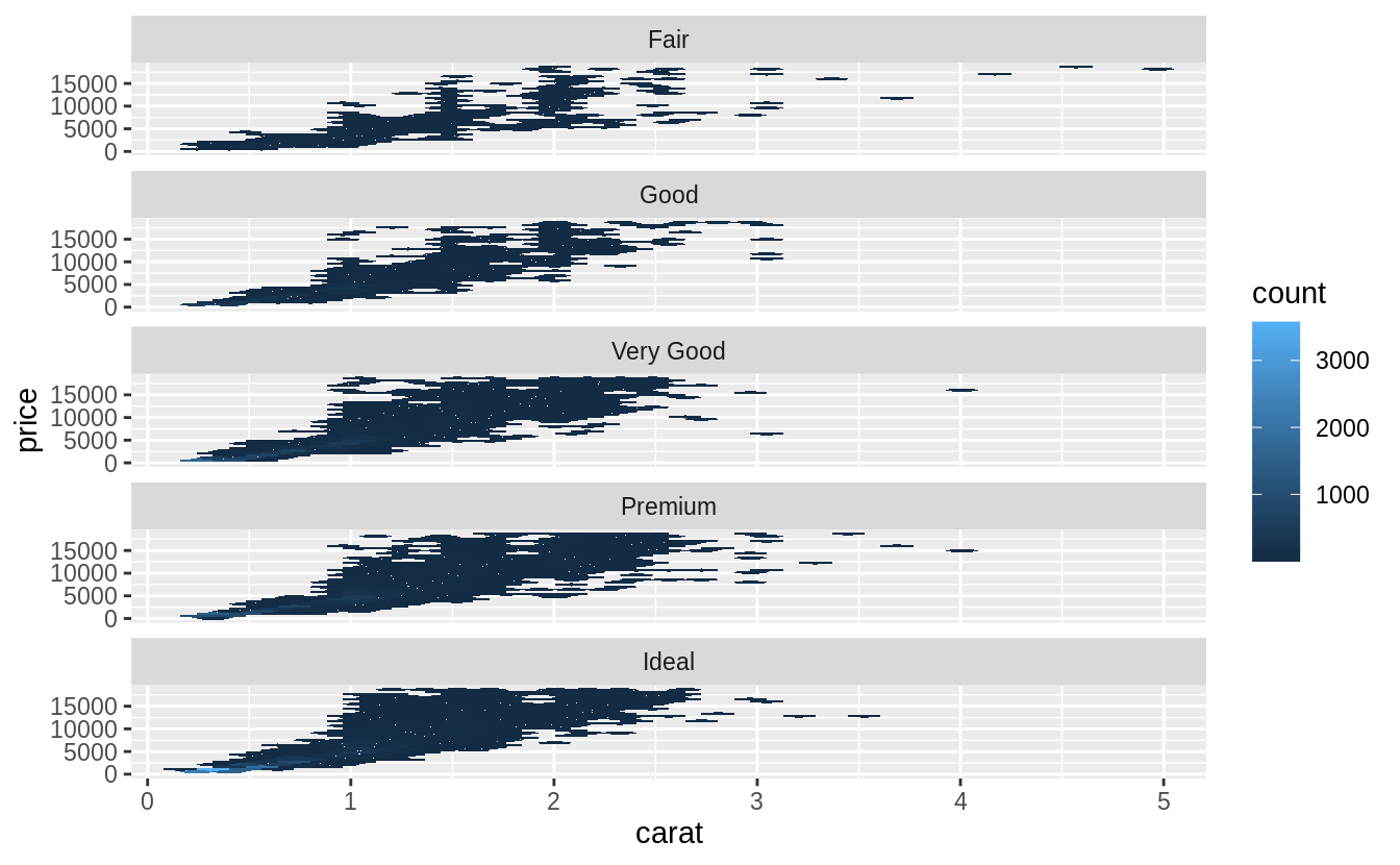
Combine two of the techniques you’ve learned to visualize the combined distribution of cut, carat, and price.
當然有非常多方法視覺化這三個變數,以下列出作者的示範:
# faceted hexagonal heatmap of 2d bin counts, faceted geom_hex() ---
install.packages("hexbin")
library(viridis)
ggplot(diamonds, aes(x = carat, y = price)) +
  geom_hex() +
  facet_wrap(~cut, ncol = 1) +
  scale_fill_viridis()

ggplot(diamonds, aes(x = cut_number(carat, 5), y = price, color = cut)) +
  geom_boxplot()
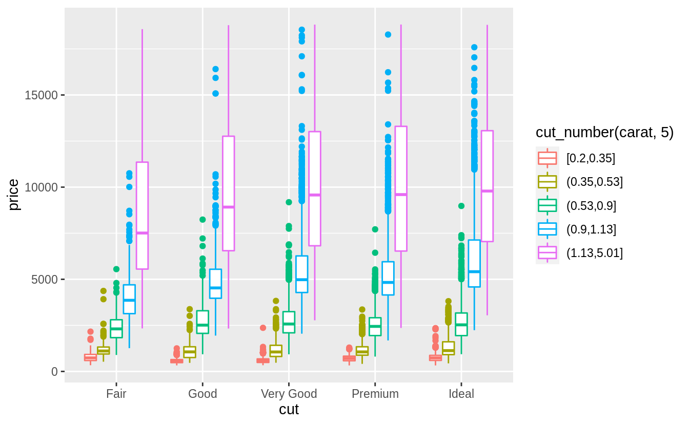
# 相較於上一個方法,將 "carat" 離散化後作為上色變數,更能看出大克拉鑽石在價格上的異質性
ggplot(diamonds, aes(color = cut_number(carat, 5), y = price, x = cut)) +
  geom_boxplot()
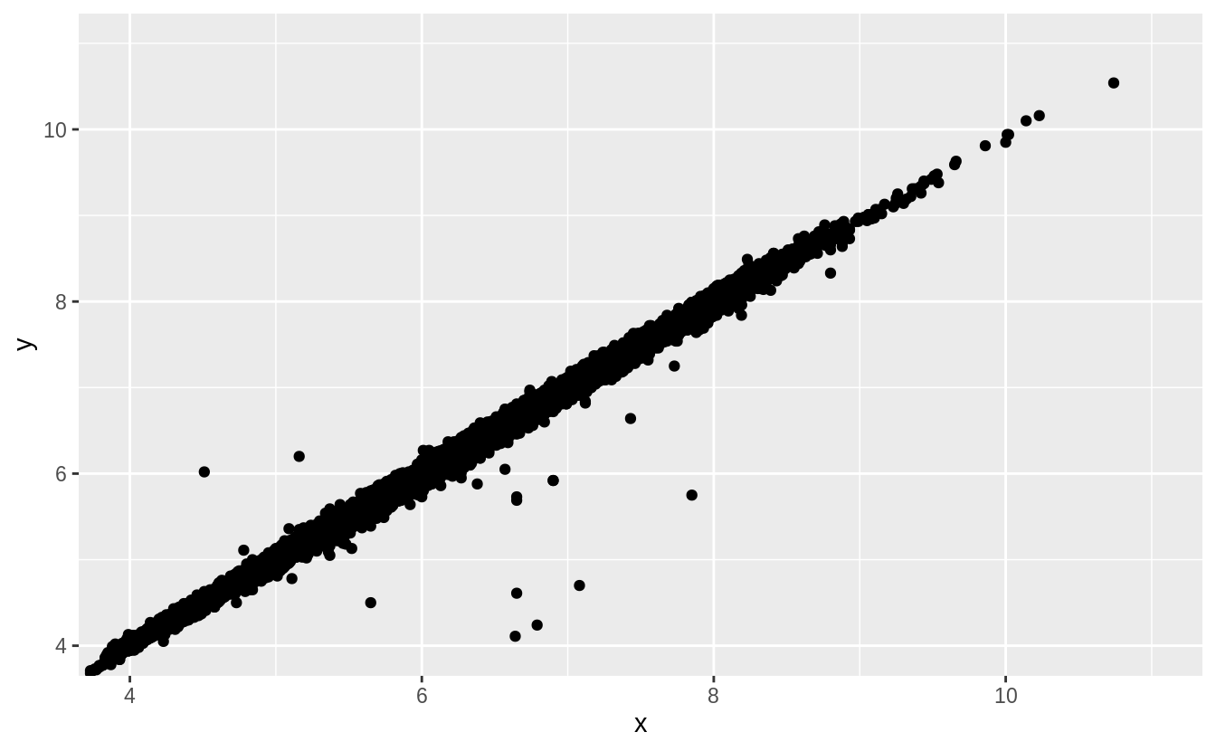
*****Exercise 7.5.3.5*****
Two dimensional plots reveal outliers that are not visible in one dimensional plots. For example, some points in the plot below have an unusual combination of
xandyvalues, which makes the points outliers even though theirxandyvalues appear normal when examined separately.
離群值 (outlier) 之檢測:某些只觀察單一維度不會發現的離群值(binned-boxplot 不會發現的離群值),繪製在二維平面以兩變數共同觀察時(繪製scatterplot),才會顯示出不尋常的落點。如以下範例:
ggplot(data = diamonds) +
  geom_point(mapping = aes(x = x, y = y)) +
  coord_cartesian(xlim = c(4, 11), ylim = c(4, 11))
注意極大的 x 值卻落在配適迴歸線上,也就是 x 變數中的離群值卻配適雙變數整體趨勢。(the largest value of xx was an outlier even though it appears to fit the bivariate pattern well.)
