7 Exploratory Data Analysis
This chapter will show you how to use visualization and transformation to explore your data in a systematic way, a task that statisticians call exploratory data analysis, or EDA for short.
EDA is an iterative cycle :
- Generate questions about your data.
- Search for answers by visualizing, transforming, and modelling your data.
^^^^^^^^^^^^^^^^^^^^^^^^^^^^^^^
the tools of EDA - Use what you learn to refine your questions and/or generate new questions.
探索性資料分析 (Exploratory Data Analysis, EDA) 就是重複:提問、以資料回答問題、根據資料修正或提出新問題的循環過程。涉及視覺化、資料轉換、建模等步驟。EDA的目的就是深入了解資料。
究竟應提出甚麼問題以開啟EDA的流程,並無特定方法或規則可依循,本書建議可以由以下兩類問題開始進行EDA:
- What type of variation occurs within my variables?
- What type of covariation occurs between my variables?
7.2節開始定義一些常用的統計學名詞:observation, variable, value, tabular data, 和大多統計書籍裡常用名詞一樣,沒有特別艱澀冷僻的概念,有一般統計概念的讀者應可迅速上手。
7.3 Variation
The best way to understand that pattern is to visualize the distribution of the variable’s values.
針對感興趣的變數的視覺化,首先需要判斷變數是離散或連續。
在R語言中,類別變數會以 factor vector 或 character vector 儲存 ,通常用 bar chart 描繪類別變數的機率分配。
library(tidyverse)
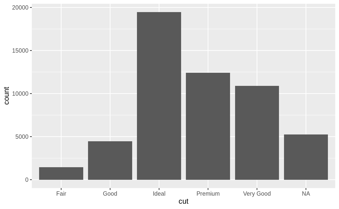
ggplot(data = diamonds) +
geom_bar(mapping = aes(x = cut))
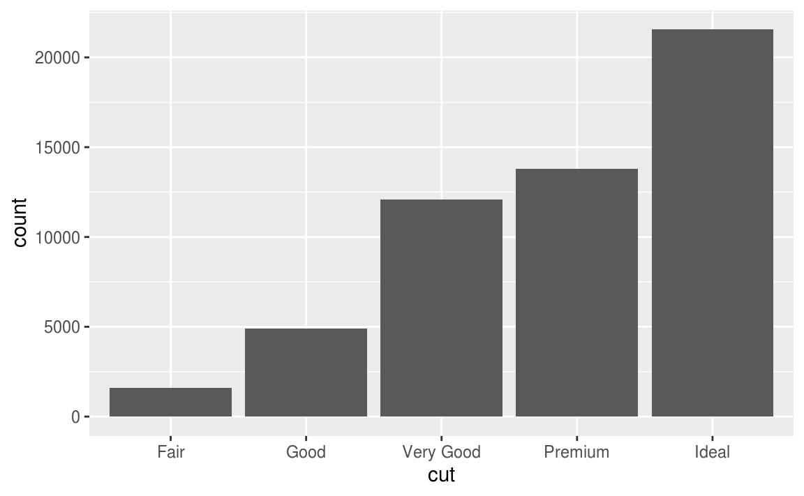
# use dplyr::count() to count sample size in each group
diamonds %>%
  count(cut)
#> # A tibble: 5 x 2
#>   cut           n
#>   <ord>     <int>
#> 1 Fair       1610
#> 2 Good       4906
#> 3 Very Good 12082
#> 4 Premium   13791
#> 5 Ideal     21551
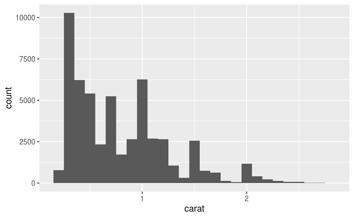
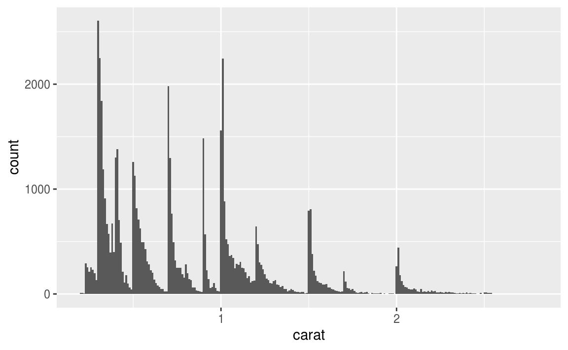
在R語言中,連續型變數會是 number 或 date-time 格式 ,通常用 histogram 描繪連續型變數的機率分配。
ggplot(data = diamonds) +
  geom_histogram(mapping = aes(x = carat), binwidth = 0.5)

# combine dplyr::count() and ggplot2::cut_width()
# to show the number of observations that fall in each bin

diamonds %>%
  count(cut_width(carat, 0.5))
#> # A tibble: 11 x 2
#>   `cut_width(carat, 0.5)`     n
#>   <fct>                   <int>
#> 1 [-0.25,0.25]              785
#> 2 (0.25,0.75]             29498
#> 3 (0.75,1.25]             15977
#> 4 (1.25,1.75]              5313
#> 5 (1.75,2.25]              2002
#> 6 (2.25,2.75]               322
#> # … with 5 more rows
繪製 histogram 時,可以使用 binwidth 調整每根 bar 的寬度(等同於用來測量 x 軸變數的單位),寬度的調整可能會改變分配形狀,如以下程式區塊及其圖形:
smaller <- diamonds %>%
  filter(carat < 3)

ggplot(data = smaller, mapping = aes(x = carat)) +
  geom_histogram(binwidth = 0.1)
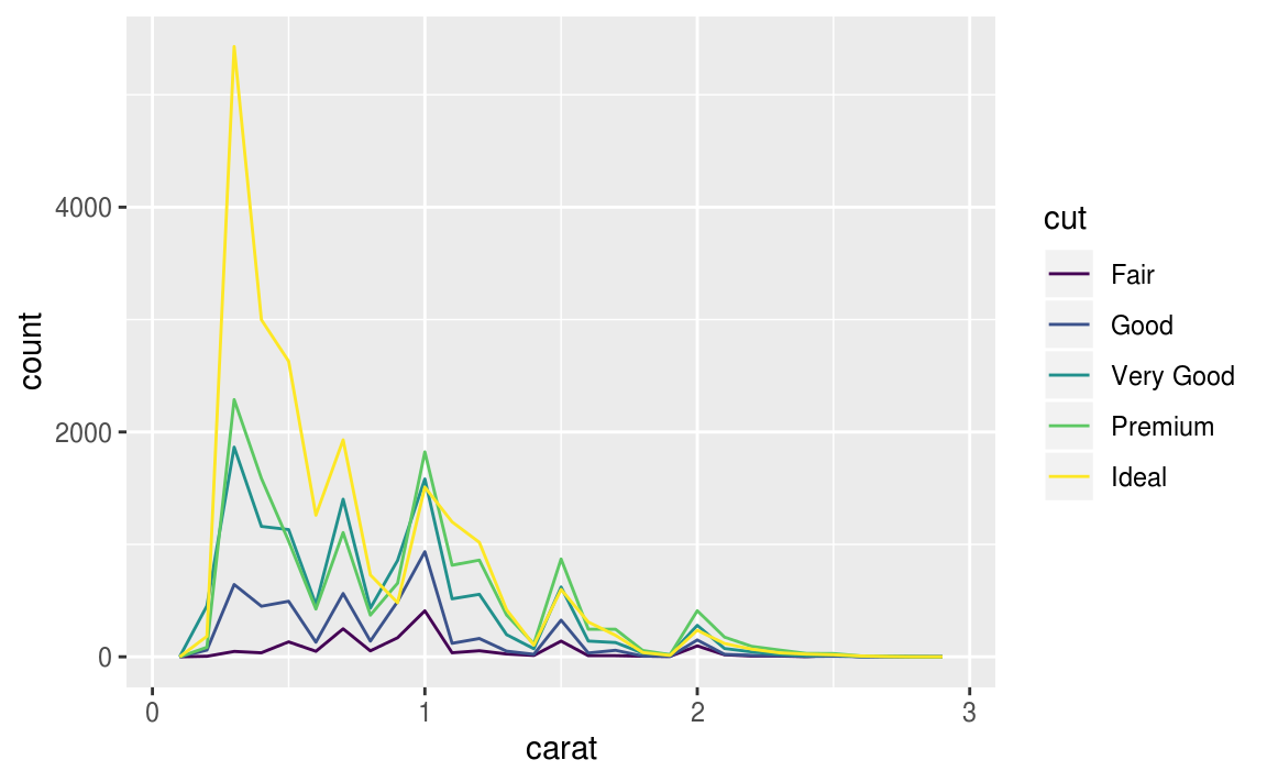
如果想在同一張圖上顯示(重疊,覆蓋)許多張 histogram ,建議使用折線圖 ,即geom_freqpoly() 函數, geom_freqpoly() 進行與 geom_histogram() 相同的計算,但是以折線描繪分配。
ggplot(data = smaller, mapping = aes(x = carat, colour = cut)) +
  geom_freqpoly(binwidth = 0.1)
以長條圖、直方圖或是直線圖描繪出分配後,可針對變數的分散趨勢,即變異性(variation)深入探討以下問題:
- Which values are the most common? Why?
- Which values are rare? Why? Does that match your expectations?
- Can you see any unusual patterns? What might explain them?
以 diamond 數據集為例,我們可以在繪出直方圖( histogram )後探討以下問題:
- Why are there more diamonds at whole carats and common fractions of carats?
- Why are there more diamonds slightly to the right of each peak than there are slightly to the left of each peak?
- Why are there no diamonds bigger than 3 carats?
smaller <- diamonds %>%
  filter(carat < 3)
ggplot(data = smaller, mapping = aes(x = carat)) +
  geom_histogram(binwidth = 0.01)
由上圖可以發現, 數個有相似值區間聚集而成的subgroup (Clusters of similar values suggest that subgroups exist in your data. ),引申出以下問題:
- How are the observations within each cluster similar to each other?
- How are the observations in separate clusters different from each other?
- How can you explain or describe the clusters?
- Why might the appearance of clusters be misleading?
7.3.3 Unusual values
Outliers are observations that are unusual; data points that don’t seem to fit the pattern.
當資料數量非常大時,直方圖難以辨認出離群值(outlier)
ggplot(diamonds) +
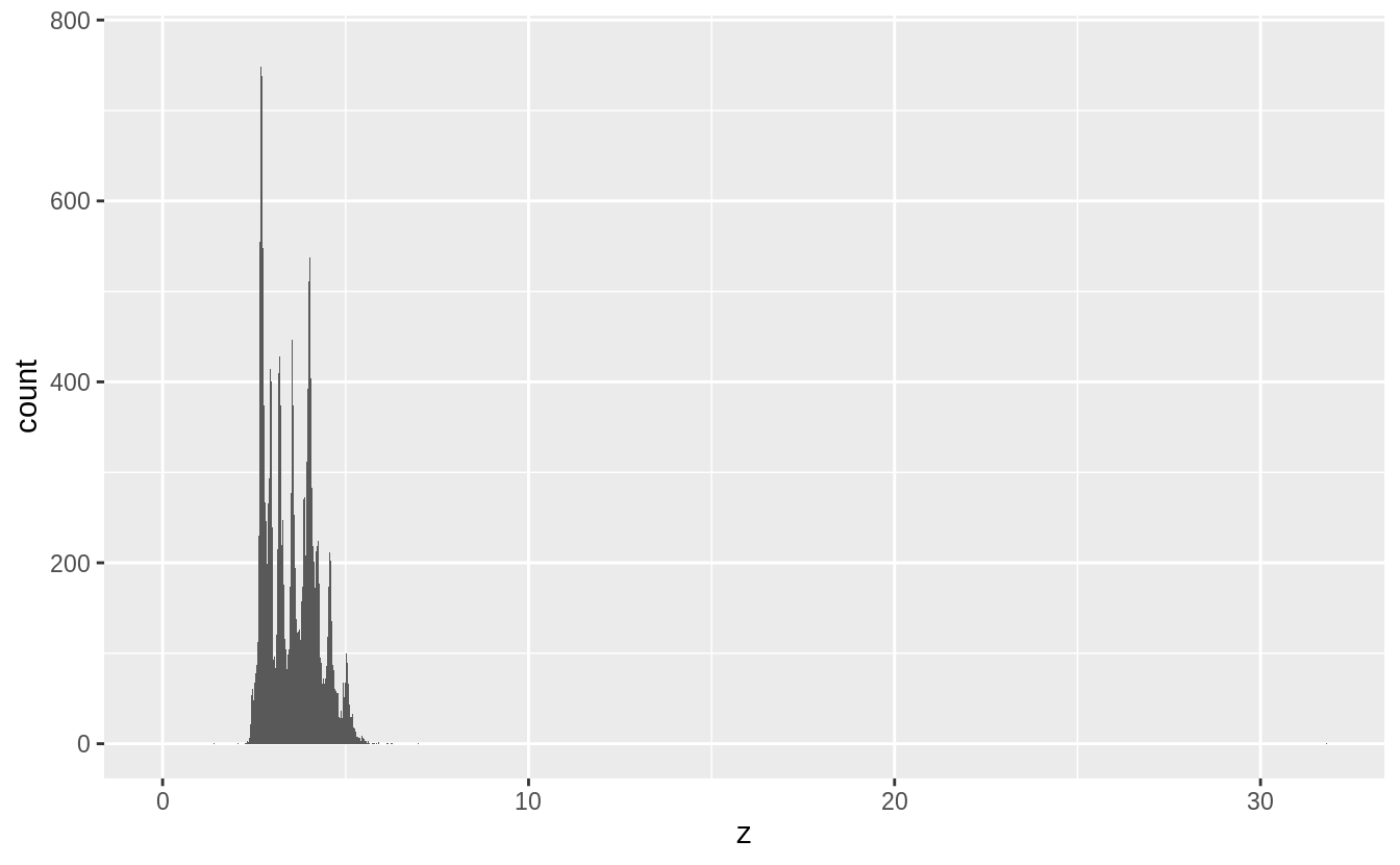
geom_histogram(mapping = aes(x = y), binwidth = 0.5)
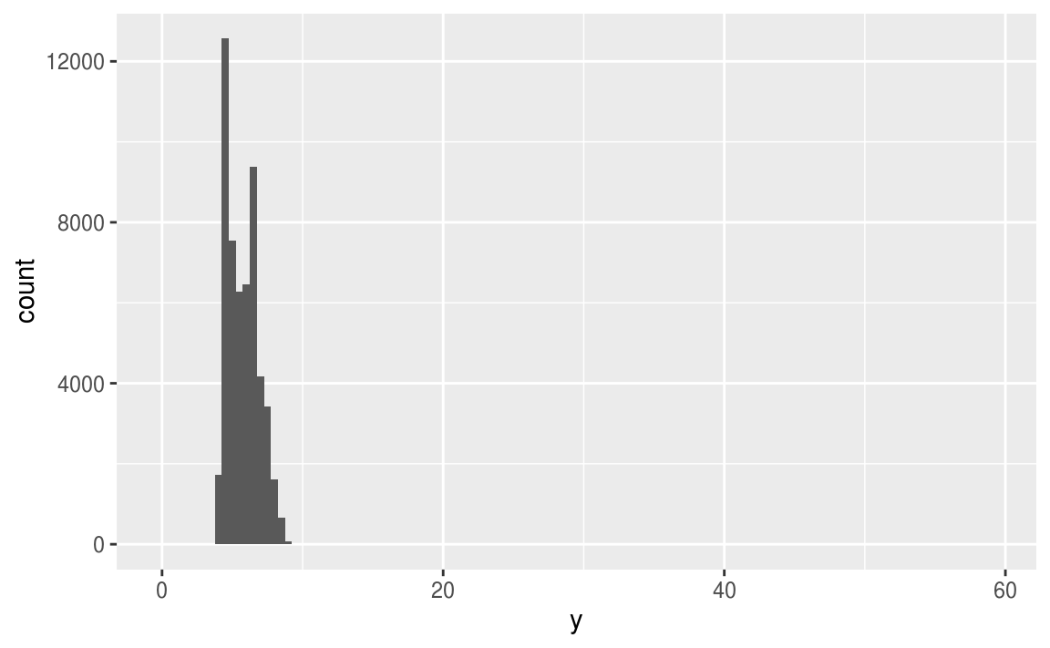
為了能夠辨認出以上直方圖中的離群值,我們可以使用 coord_cartesian() 函數,將 y 軸的單位 zoom-in 至較小的全距。
The Cartesian coordinate system (笛卡爾座標) is the most familiar, and common, type of coordinate system.
Setting limits on the coordinate system will zoom the plot (like you’re looking at it with a magnifying glass), and will not change the underlying data like setting limits on a scale will.
ggplot(diamonds) +
  geom_histogram(mapping = aes(x = y), binwidth = 0.5) +
  coord_cartesian(ylim = c(0, 50))
  # y 軸全距只顯示 (0, 50)
# 在 ggplot中也有 xlim() ylim() 函數,但是採取直接把設定範圍之外的
# 資料點全部丟棄的做法,和 coord_cartesian() 的作法不同 ---
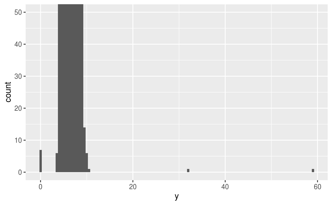
由上圖可看出,在 x軸 ( y值 ) 為0, 約30, 約60的地方有離群值。進一步抓出這些離群值:
unusual <- diamonds %>%
  filter(y < 3 | y > 20) %>%
  select(price, x, y, z) %>%
  arrange(y)
unusual
#> # A tibble: 9 x 4
#>   price     x     y     z
#>   <int> <dbl> <dbl> <dbl>
#> 1  5139  0      0    0
#> 2  6381  0      0    0
#> 3 12800  0      0    0
#> 4 15686  0      0    0
#> 5 18034  0      0    0
#> 6  2130  0      0    0
#> 7  2130  0      0    0
#> 8  2075  5.15  31.8  5.12
#> 9 12210  8.09  58.9  8.06
y 變數測量的是鑽石在三個不同維度的數值,以 mm為單位,顯然不可能出現數值為零的觀察值,故可以剔除這些數值為零的觀察值。 32mm 與 59mm 的觀察值也明顯不合哩,因為這樣的寬度對於鑽石來說太過離譜。
若去除離群值後的分析結果幾乎等於保留離群值的分析結果,可以使用遺漏值( missing value )取代離群值;若去除離群值的分析結果與保留離群值的分析結果差距甚大,就必須進一步研究造成離群值的原因。
7.3.1
Explore the distribution of each of the x, y, and z variables in diamonds. What do you learn? Think about a diamond and how you might decide which dimension is the length, width, and depth.
# 首先使用 summary() 列出各變數的敘述統計量
summary(select(diamonds, x, y, z))
#>        x               y              z
#>  Min.   : 0.00   Min.   : 0.0   Min.   : 0.0
#>  1st Qu.: 4.71   1st Qu.: 4.7   1st Qu.: 2.9
#>  Median : 5.70   Median : 5.7   Median : 3.5
#>  Mean   : 5.73   Mean   : 5.7   Mean   : 3.5
#>  3rd Qu.: 6.54   3rd Qu.: 6.5   3rd Qu.: 4.0
#>  Max.   :10.74   Max.   :58.9   Max.   :31.8

#再繪製各變數的密度分配,連續型變數使用直方圖
ggplot(diamonds) +
  geom_histogram(mapping = aes(x = x), binwidth = 0.01)

ggplot(diamonds) +
  geom_histogram(mapping = aes(x = y), binwidth = 0.01)

ggplot(diamonds) +
  geom_histogram(mapping = aes(x = z), binwidth = 0.01)

綜合以上統計量與機率密度分配,我們有以下幾點發現:
- 針對各變數之四分位距 ( interquartile range, IQR, Q3 – Q1) 知, x 與 y 普遍的觀察值大於 z ( with
xandyhaving inter-quartile ranges of 4.7-6.5, whilezhas an inter-quartile range of 2.9-4.0 ) - 各變數皆有離群值
- 各變數之機率密度分配皆為右偏(正偏)分配
- 各變數之機率密度分配皆有多個peak,可能屬於multimodal distribution
# 比較三個變數之間的大小關係
summarise(diamonds, mean(x > y), mean(x > z), mean(y > z))
#> # A tibble: 1 x 3
#>   `mean(x > y)` `mean(x > z)` `mean(y > z)`
#>           <dbl>         <dbl>         <dbl>
#> 1         0.434         1.000         1.000
# 取出各變數中數值為零的觀察值,進一步研究這些離群值
filter(diamonds, x == 0 | y == 0 | z == 0)

#> # A tibble: 20 x 10
#>   carat cut     color clarity depth table price     x     y     z
#>   <dbl> <ord>   <ord> <ord>   <dbl> <dbl> <int> <dbl> <dbl> <dbl>
#> 1  1    Premium G     SI2      59.1    59  3142  6.55  6.48     0
#> 2  1.01 Premium H     I1       58.1    59  3167  6.66  6.6      0
#> 3  1.1  Premium G     SI2      63      59  3696  6.5   6.47     0
#> 4  1.01 Premium F     SI2      59.2    58  3837  6.5   6.47     0
#> 5  1.5  Good    G     I1       64      61  4731  7.15  7.04     0
#> 6  1.07 Ideal   F     SI2      61.6    56  4954  0     6.62     0
#> # … with 14 more rows
# 取出變數 y、z 中,數值異常大的離群值
# 分別是 y == 58.9, y == 31.8, z == 31.8
# 由大到小列出前幾筆數值
diamonds %>%
  arrange(desc(y)) %>%
  head()
#> # A tibble: 6 x 10
#>   carat cut     color clarity depth table price     x     y     z
#>   <dbl> <ord>   <ord> <ord>   <dbl> <dbl> <int> <dbl> <dbl> <dbl>
#> 1  2    Premium H     SI2      58.9    57 12210  8.09 58.9   8.06
#> 2  0.51 Ideal   E     VS1      61.8    55  2075  5.15 31.8   5.12
#> 3  5.01 Fair    J     I1       65.5    59 18018 10.7  10.5   6.98
#> 4  4.5  Fair    J     I1       65.8    58 18531 10.2  10.2   6.72
#> 5  4.01 Premium I     I1       61      61 15223 10.1  10.1   6.17
#> 6  4.01 Premium J     I1       62.5    62 15223 10.0   9.94  6.24
# 由大到小列出前幾筆數值
diamonds %>%
  arrange(desc(z)) %>%
  head()
#> # A tibble: 6 x 10
#>   carat cut       color clarity depth table price     x     y     z
#>   <dbl> <ord>     <ord> <ord>   <dbl> <dbl> <int> <dbl> <dbl> <dbl>
#> 1  0.51 Very Good E     VS1      61.8  54.7  1970  5.12  5.15 31.8
#> 2  2    Premium   H     SI2      58.9  57   12210  8.09 58.9   8.06
#> 3  5.01 Fair      J     I1       65.5  59   18018 10.7  10.5   6.98
#> 4  4.5  Fair      J     I1       65.8  58   18531 10.2  10.2   6.72
#> 5  4.13 Fair      H     I1       64.8  61   17329 10     9.85  6.43
#> 6  3.65 Fair      H     I1       67.1  53   11668  9.53  9.48  6.38
觀察到:不同變數的離群值之間似乎沒有相關聯。
進一步針對兩兩變數做散佈圖,觀察變數與變數之間的關係:
ggplot(diamonds, aes(x = x, y = y)) +
  geom_point()
ggplot(diamonds, aes(x = x, y = z)) +
  geom_point()
ggplot(diamonds, aes(x = y, y = z)) +
  geom_point()
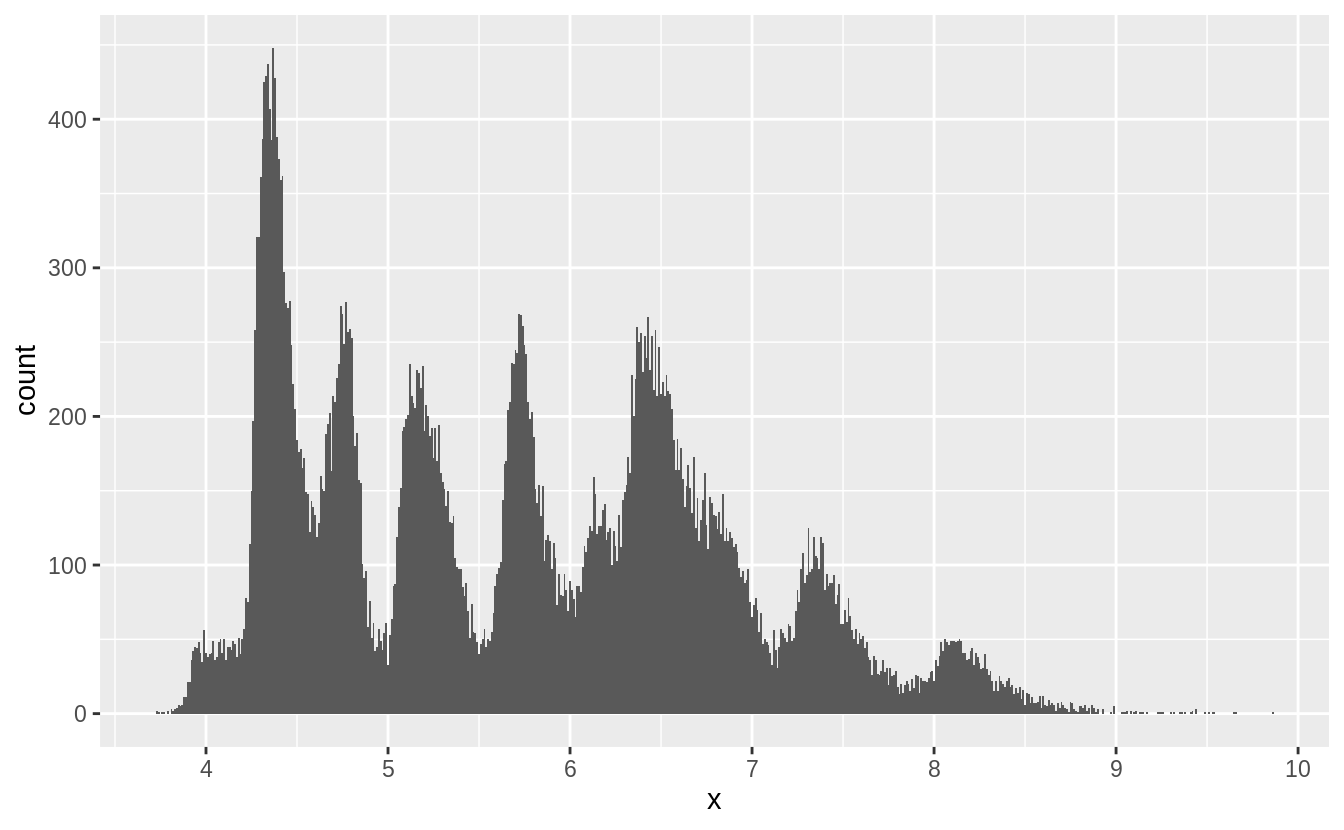
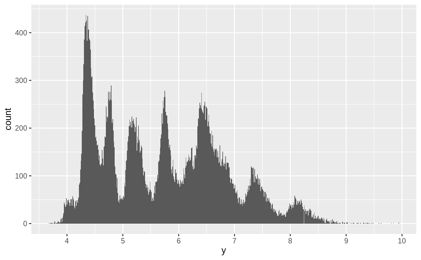
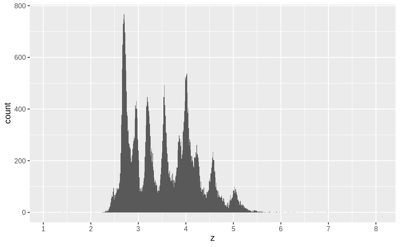
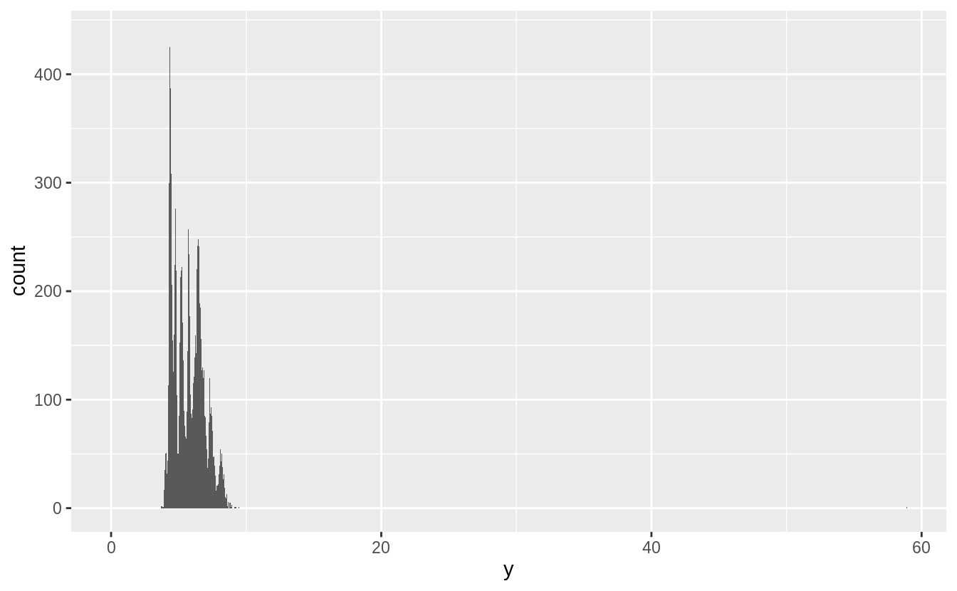
以下我們將原始資料剔除離群值後,探索 x, y, z 三個變數的機率密度分布:
filter(diamonds, x > 0, x < 10) %>%
  ggplot() +
  geom_histogram(mapping = aes(x = x), binwidth = 0.01) +
  scale_x_continuous(breaks = 1:10)
#^^^^^^^^^^^^^^^^^^^調整 x 軸單位


filter(diamonds, y > 0, y < 10) %>%
  ggplot() +
  geom_histogram(mapping = aes(x = y), binwidth = 0.01) +
  scale_x_continuous(breaks = 1:10)

filter(diamonds, z > 0, z < 10) %>%
  ggplot() +
  geom_histogram(mapping = aes(x = z), binwidth = 0.01) +
  scale_x_continuous(breaks = 1:10)

由以上三張圖,推測出 spike來自於鑽石切割中常用的數值。
Exercise 7.3.2
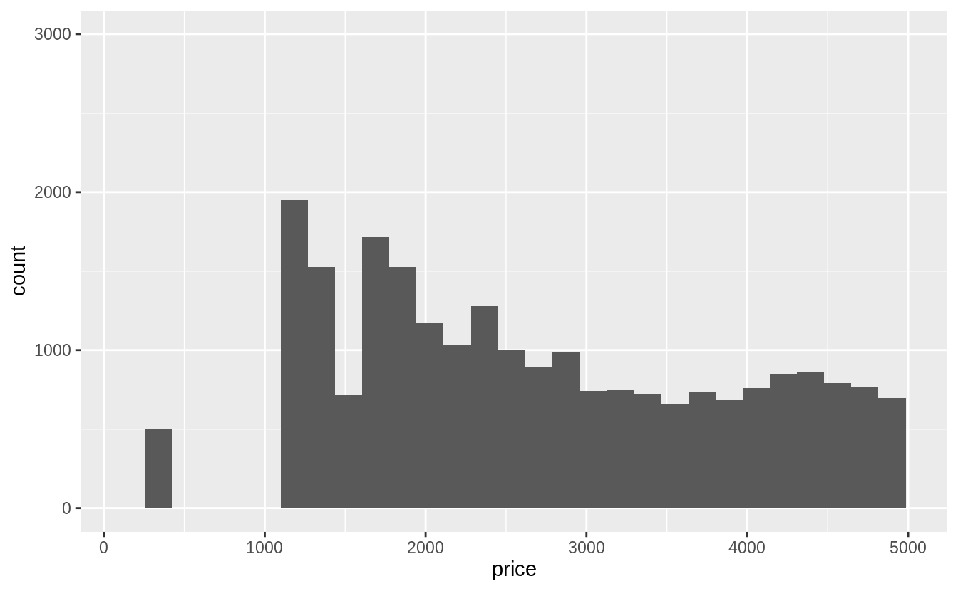
Explore the distribution of price. Do you discover anything unusual or surprising? (Hint: Carefully think about the binwidth and make sure you try a wide range of values.)
藉由改變直方圖的binwidth,觀察變數的 global feature 和 local feature
summary(select(diamonds, price))
#     price
# Min.   :  326
# 1st Qu.:  950
# Median : 2401
# Mean   : 3933
# 3rd Qu.: 5324
# Max.   :18823
# 先針對小於中位數的數值繪圖
# binwidth = 10
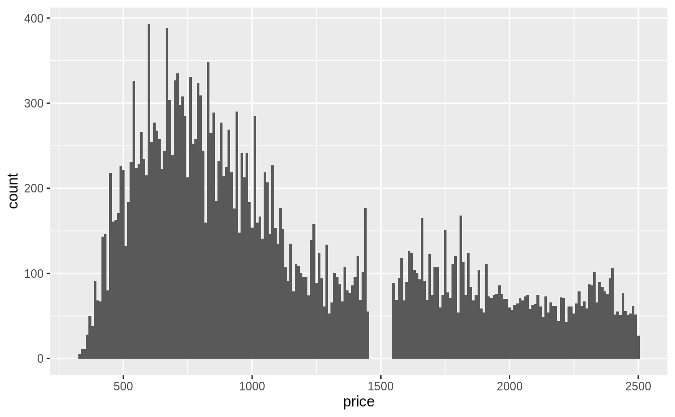
ggplot(filter(diamonds, price < 2500), aes(x = price)) +
#data = ^^^^^^^^^^^^^^^^^^^^^^^^^^^^^
geom_histogram(binwidth = 10, center = 0)
# 針對全部資料作圖
# binwidth = 100
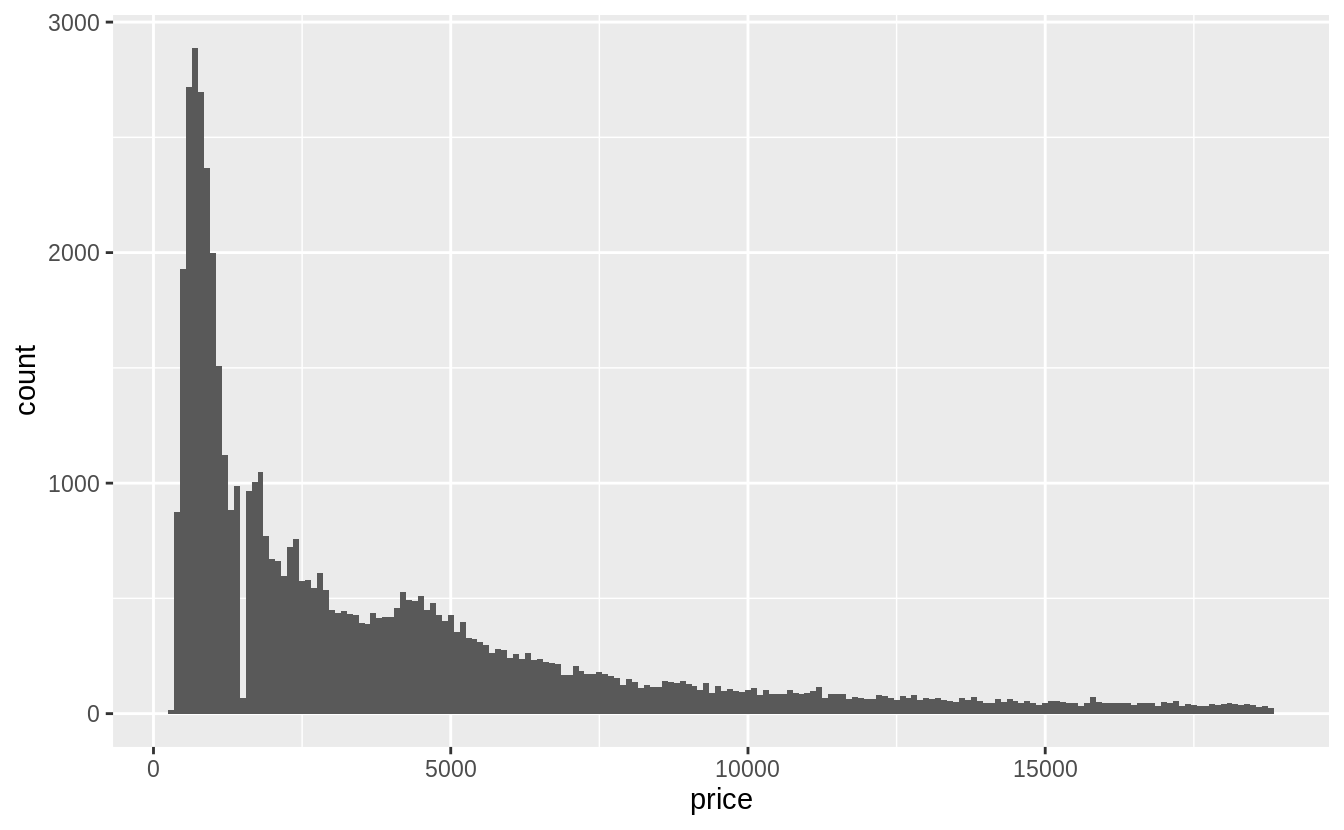
ggplot(filter(diamonds), aes(x = price)) +
geom_histogram(binwidth = 100, center = 0)
Exercise 7.3.3
How many diamonds are 0.99 carat? How many are 1 carat? What do you think is the cause of the difference?
diamonds %>%
  filter(carat >= 0.99, carat <= 1) %>%
# 列出 carat 介於 0.99 到 1 間的觀察值
  count(carat)
#> # A tibble: 2 x 2
#>   carat     n
#>   <dbl> <int>
#> 1  0.99    23
#> 2  1     1558
1 克拉的觀察值個數是0.99克拉的近七十倍。
Exercise 7.3.4
Compare and contrast coord_cartesian() vs xlim() or ylim() when zooming in on a histogram. What happens if you leave binwidth unset? What happens if you try and zoom so only half a bar shows?
coord_cartesian() 函數是在運算及繪圖之後,針對指定(限定)的範圍 zoom-in
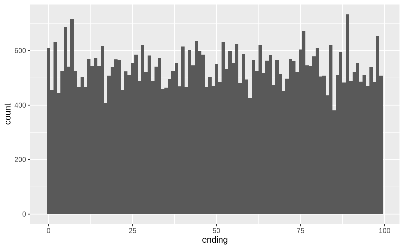
ggplot(diamonds) +
  geom_histogram(mapping = aes(x = price)) +
  coord_cartesian(xlim = c(100, 5000), ylim = c(0, 3000))
xlim() 與 ylim() 函數則是在函數運算前針對統計量做限制,落在 x- 與 y-limits 之外的數據皆會被丟棄, 會影響整體直方圖的長相。
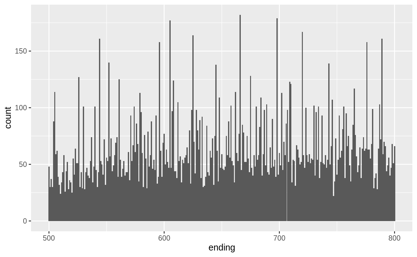
ggplot(diamonds) +
  geom_histogram(mapping = aes(x = price)) +
  xlim(100, 5000) +
  ylim(0, 3000)