3.8 Position adjustments
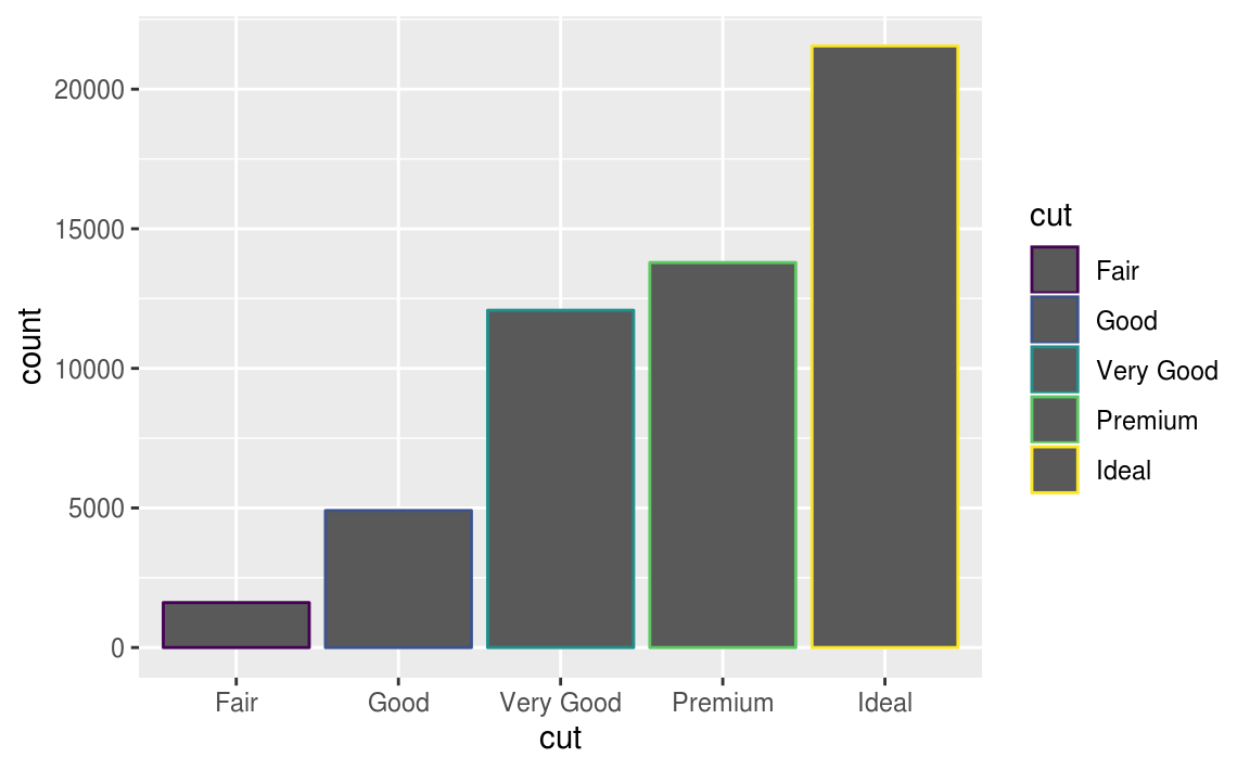
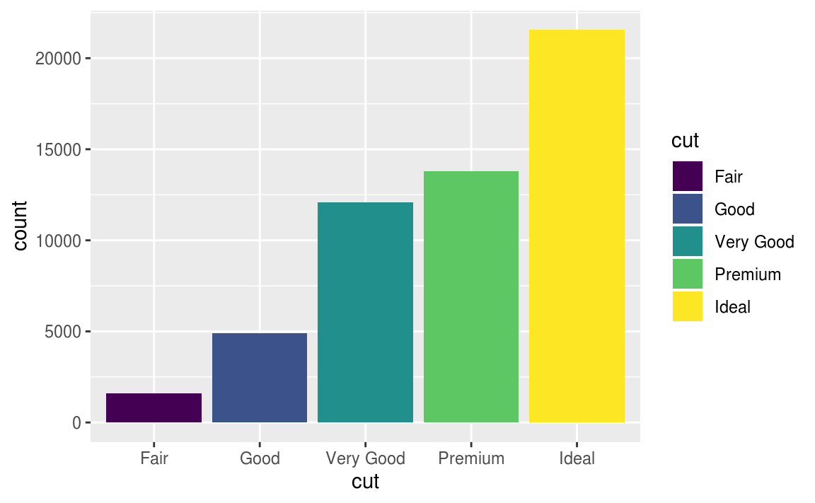
You can color a bar chart using either the color aesthetic, or, more usefully, fill.
ggplot(data = diamonds) +
  geom_bar(mapping = aes(x = cut, color = cut))

# use the fill aesthetic
ggplot(data = diamonds) +
  geom_bar(mapping = aes(x = cut, fill = cut))
- map the
fillaesthetic to another variable
# map the fill aesthetic to another variable, like clarity:
# the bars are automatically stacked.
# Each colored rectangle represents a combination of cut and clarity---
ggplot(data = diamonds) +
  geom_bar(mapping = aes(x = cut, fill = clarity)) #default position = "stack"
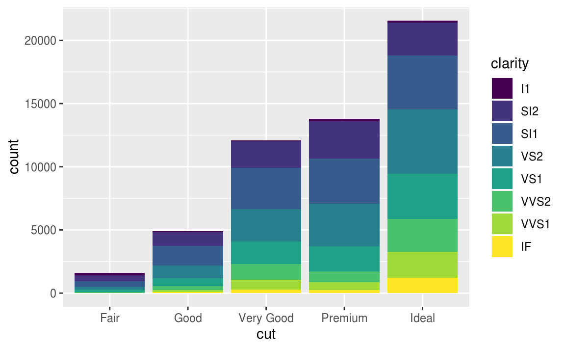
The stacking is performed automatically by the position adjustment specified by the position argument.
The position argument included three options: "identity", "dodge" or "fill".
# default position argument, position = "stack"
# 累加的概念,逐類別堆疊累加
ggplot(data = diamonds, mapping = aes(x = cut, fill = clarity)) +
  geom_bar(position = "stack")
#identity顯示每個類別中的數值
#more useful for 2d geoms, like points, where it is the default.
ggplot(data = diamonds, mapping = aes(x = cut, fill = clarity)) +
  geom_bar(position = "identity")

#設定透明度可以解決overlapping的問題,更容易觀察每個類別中的counts
ggplot(data = diamonds, mapping = aes(x = cut, fill = clarity)) +
  geom_bar(alpha = 1/5, position = "identity")


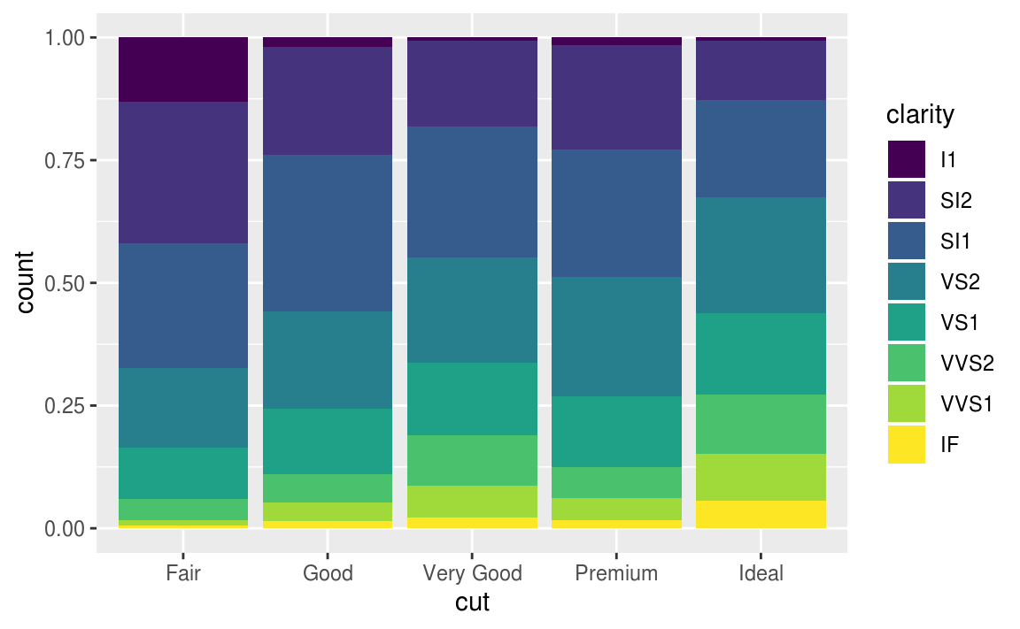
#position = "fill"
#每根stacking bar標準化成同高度,且y軸為比率而非counts
#呈現每個cut中,每種不同clarity所占的比率
#This makes it easier to compare proportions across groups.

ggplot(data = diamonds, mapping = aes(x = cut, fill = clarity)) +
  geom_bar(position = "fill")
#position = "dodge"
#一種clarity * 一種cut 畫一根bar(共有8*5 = 40種組合,40根bar),以cut level群組化,並列這些bar
#This makes it easier to compare individual values.
#it can be very useful for scatter plots

ggplot(data = diamonds, mapping = aes(x = cut, fill = clarity)) +
  geom_bar(position = "dodge")

當每個點有一個以上的量時,jitter 會把它隨機分散。 可以設定其散落的範圍,可以把重疊的資料點分開,用以解決overplotting的問題。
#overplotting
#that the plot displays only 126 points, even though there are 234 observations in the data set
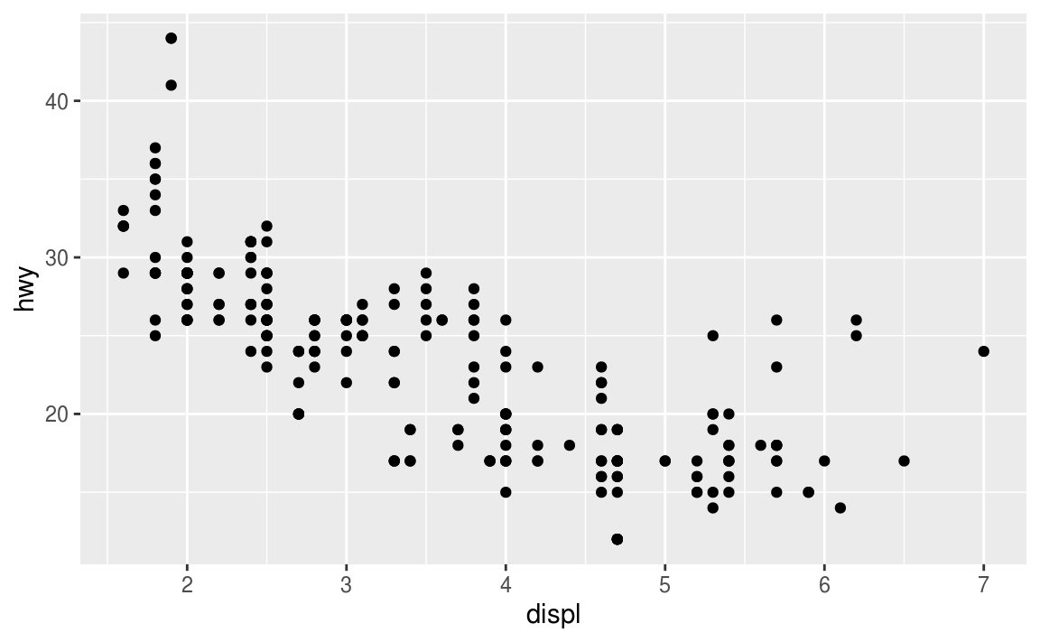
ggplot(data = mpg) +
geom_point(mapping = aes(x = displ, y = hwy))
#position = "jitter"
ggplot(data = mpg) +
  geom_point(mapping = aes(x = displ, y = hwy), position = "jitter")

- Compare and contrast
geom_jitter()withgeom_count().
# geom_jitter() adds random variation to the locations points of the graph
ggplot(data = mpg, mapping = aes(x = cty, y = hwy)) +
  geom_jitter()
# geom_count() sizes the points relative to the number of observations.
# Combinations of (x, y) values with more observations will be larger than
# those with fewer observations.
# geom_count() does not change x and y coordinates of the points

ggplot(data = mpg, mapping = aes(x = cty, y = hwy)) +
  geom_count()
As that example shows, unfortunately, there is no universal solution to overplotting. The costs and benefits of different approaches will depend on the structure of the data and the goal of the data scientist.
3.9 Coordinate systems
The default coordinate system is the Cartesian coordinate system where the x and y positions act independently to determine the location of each point. There are a number of other coordinate systems that are occasionally helpful.
-
coord_flip()switches the x and y axes. This is useful (for example), if you want horizontal boxplots. It’s also useful for long labels.
ggplot(data = mpg, mapping = aes(x = class, y = hwy)) +
  geom_boxplot()

ggplot(data = mpg, mapping = aes(x = class, y = hwy)) +
  geom_boxplot() +
  coord_flip()


-
coord_quickmap()sets the aspect ratio correctly for maps. This is very important if you’re plotting spatial data with ggplot2.
nz <- map_data("nz")

ggplot(nz, aes(long, lat, group = group)) +
  geom_polygon(fill = "white", colour = "black")

ggplot(nz, aes(long, lat, group = group)) +
  geom_polygon(fill = "white", colour = "black") +
  coord_quickmap()
-
coord_polar()uses polar coordinates. Polar coordinates reveal an interesting connection between a bar chart and a Coxcomb chart.
bar <- ggplot(data = diamonds) +
  geom_bar(
    mapping = aes(x = cut, fill = cut),
    show.legend = FALSE,
    width = 1
  ) +
  theme(aspect.ratio = 1) +
  labs(x = NULL, y = NULL)

bar + coord_flip()
bar + coord_polar()
Exercise 3.9.1
A pie chart is a stacked bar chart with the addition of polar coordinates.
Exercise 3.9.2
The labs function adds axis titles, plot titles, and a caption to the plot.
3.10 The layered grammar of graphics, a formal system for building plots
#code template
#<PARAMETER>
ggplot(data = <DATA>) +
  <GEOM_FUNCTION>(
     mapping = aes(<MAPPINGS>),
     stat = <STAT>,
     position = <POSITION>
  ) +
  <COORDINATE_FUNCTION> +
  <FACET_FUNCTION>
